A Familiar Name. A Fresh Experience.
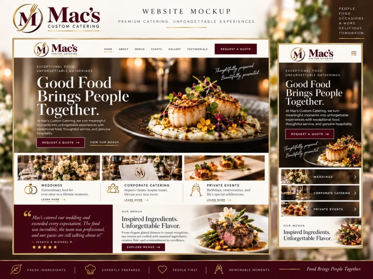
Patrick, having worked with Mac’s on both websites over the years, I wanted to share a fresh creative direction for the business we already know. This presentation explores how the catering service and the restaurant could share one recognizable visual identity while retaining their individual purposes. It also illustrates how a redesigned catering website could make menus easier to explore, improve the event inquiry and ordering experience, and create a more consistent impression from the first visit to the final gathering. These are concepts for us to discuss together, not a decision to discard what has served Mac’s well.
One Business Story, Two Customer Experiences.
Mac’s has more than one way to welcome customers: custom catering for weddings, workplaces and private gatherings, and a restaurant and live-music experience at the shared Eugene location. Having developed the existing websites, Fluidity Studio understands that any refresh should respect the familiar Mac’s name and the investment already made in menus, content and online ordering. The next step is to assess what can be retained, simplified and improved without disrupting what currently works.
A Longstanding Client Relationship
Fluidity Studio built the existing catering and restaurant/live-music websites. We can approach a refresh with the advantage of knowing the two-site setup rather than beginning with an unfamiliar business.
Distinct Ways Customers Find Mac’s
Catering customers may be planning a wedding, office lunch or private event; restaurant visitors may be interested in dining and a live-music night. Each audience needs a clear route to the right experience.
An Established Ordering Foundation
The catering site currently handles much of its ordering through older WooCommerce workflows. Those functions still operate, but a purpose-built quote or configurable order flow may be more natural for group catering.
A Shared Physical Home
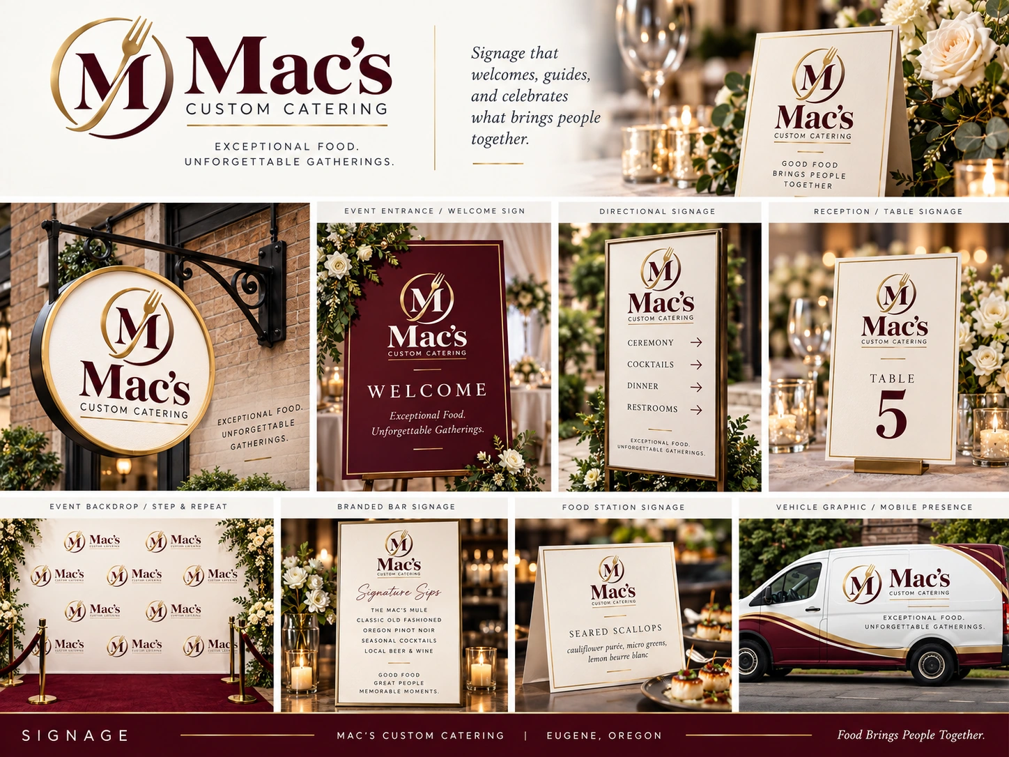
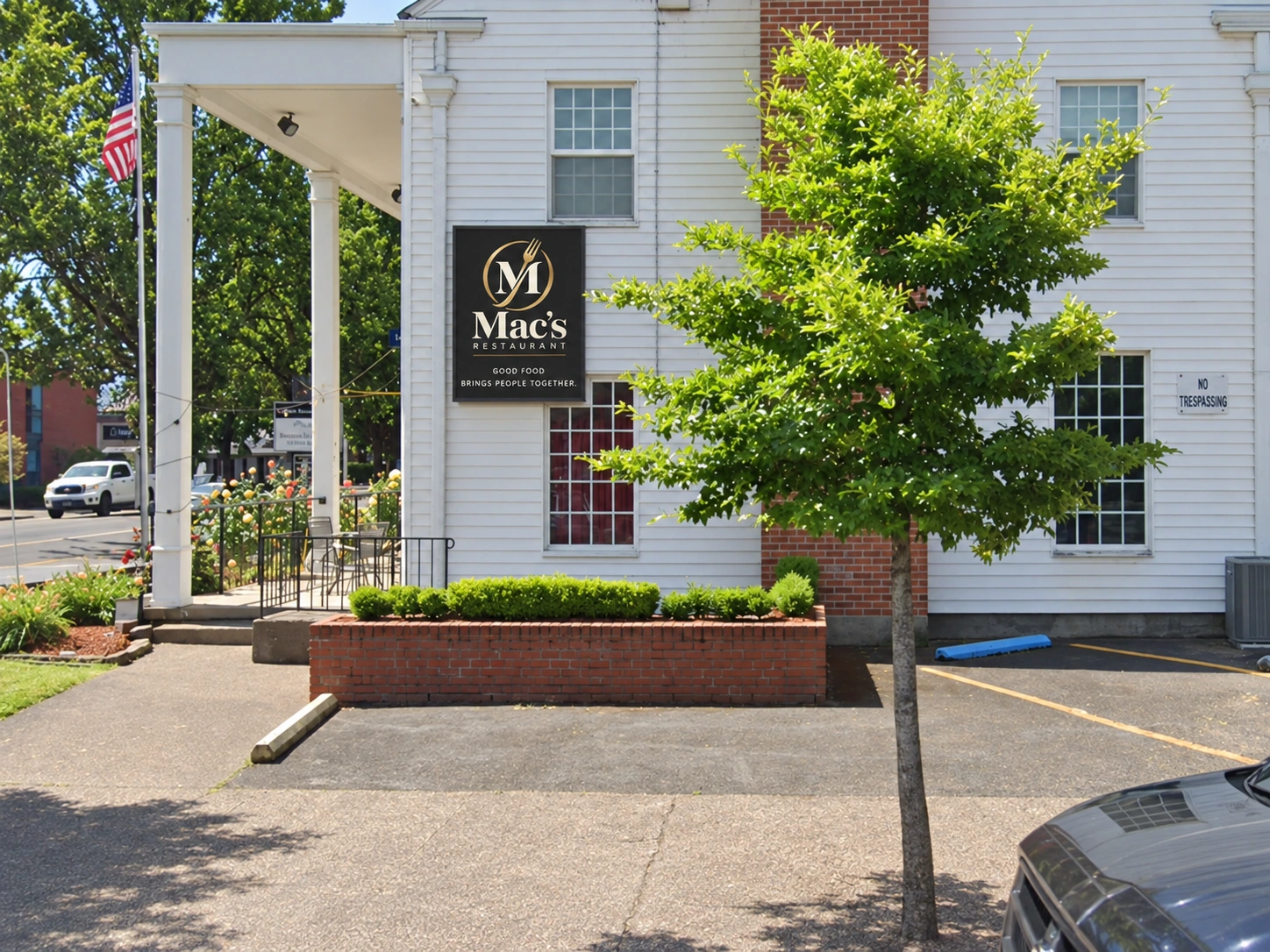
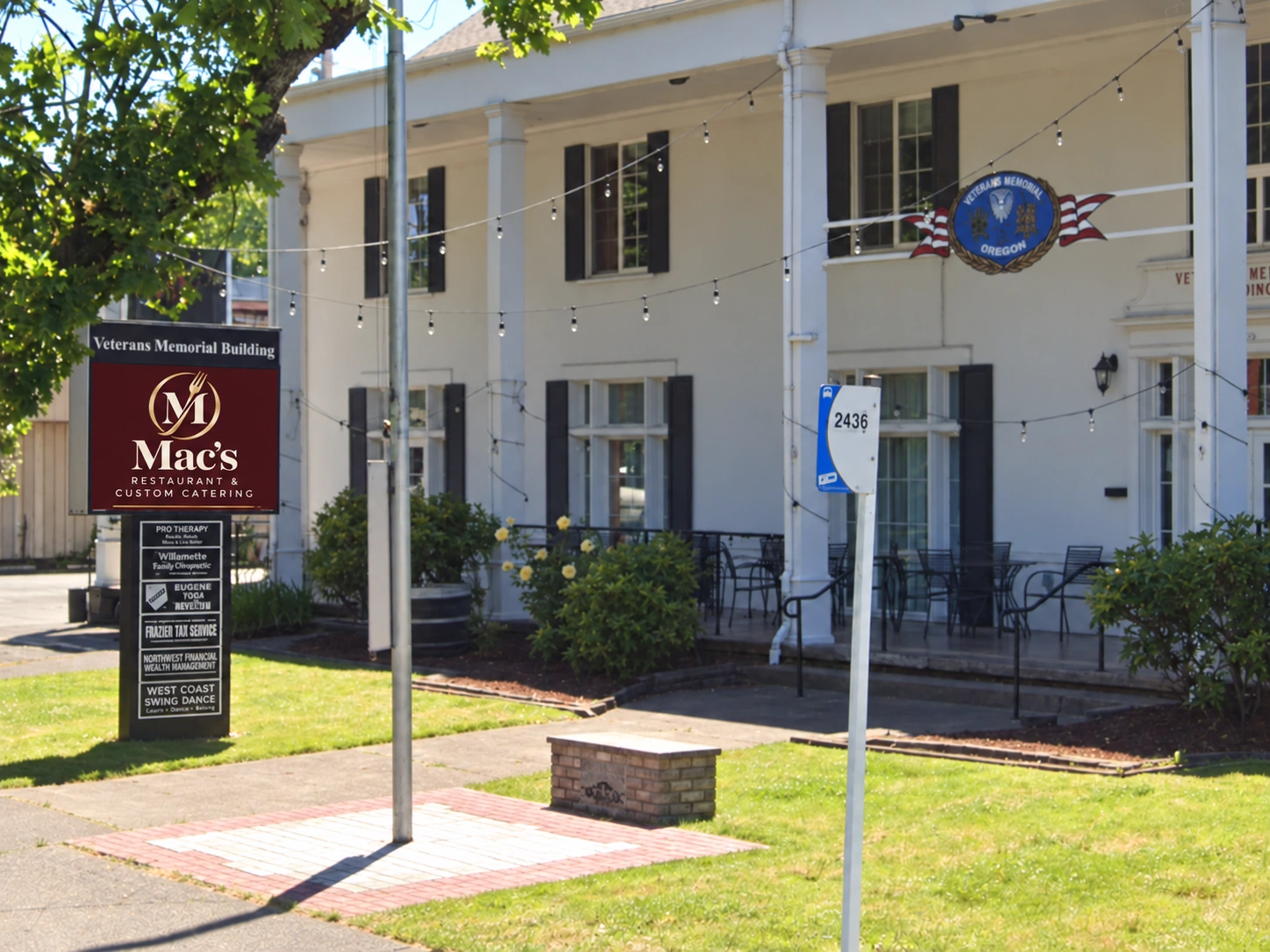
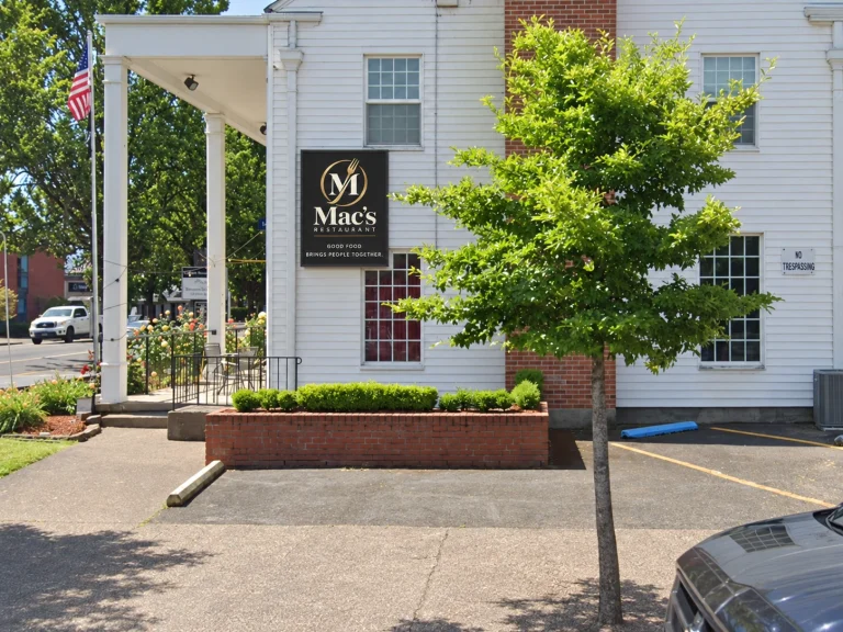
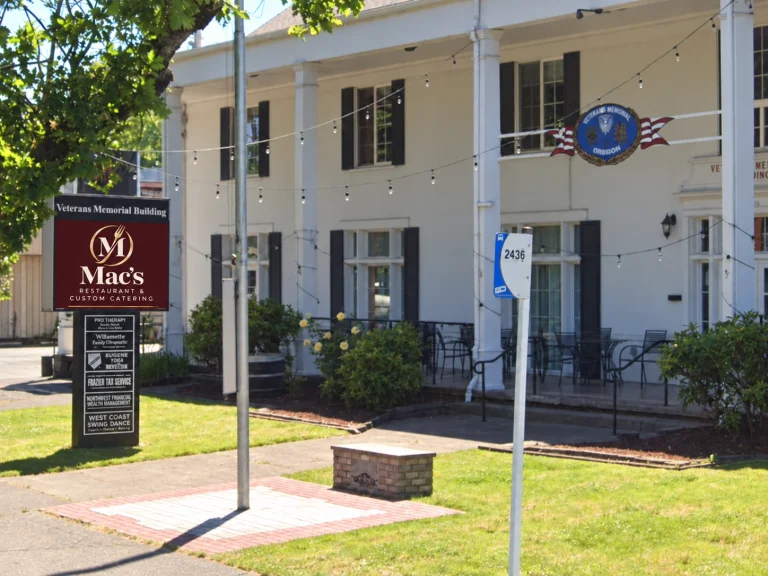
Both sides of the business operate from the same location. The exterior wall sign, front monument sign and customer-facing materials can reinforce one Mac’s identity while identifying the correct service.
Make It Easier to Recognize, Explore and Order.
The opportunity is not merely to swap a logo or rebuild pages for their own sake. It is to connect the catering and restaurant experiences under a recognizable family identity, while making it simpler for customers to understand the offering and take the next step. We can start with the highest-value changes and leave the restaurant website redesign as a separate decision for later.
A Signature M That Belongs to Both Sides of Mac’s.
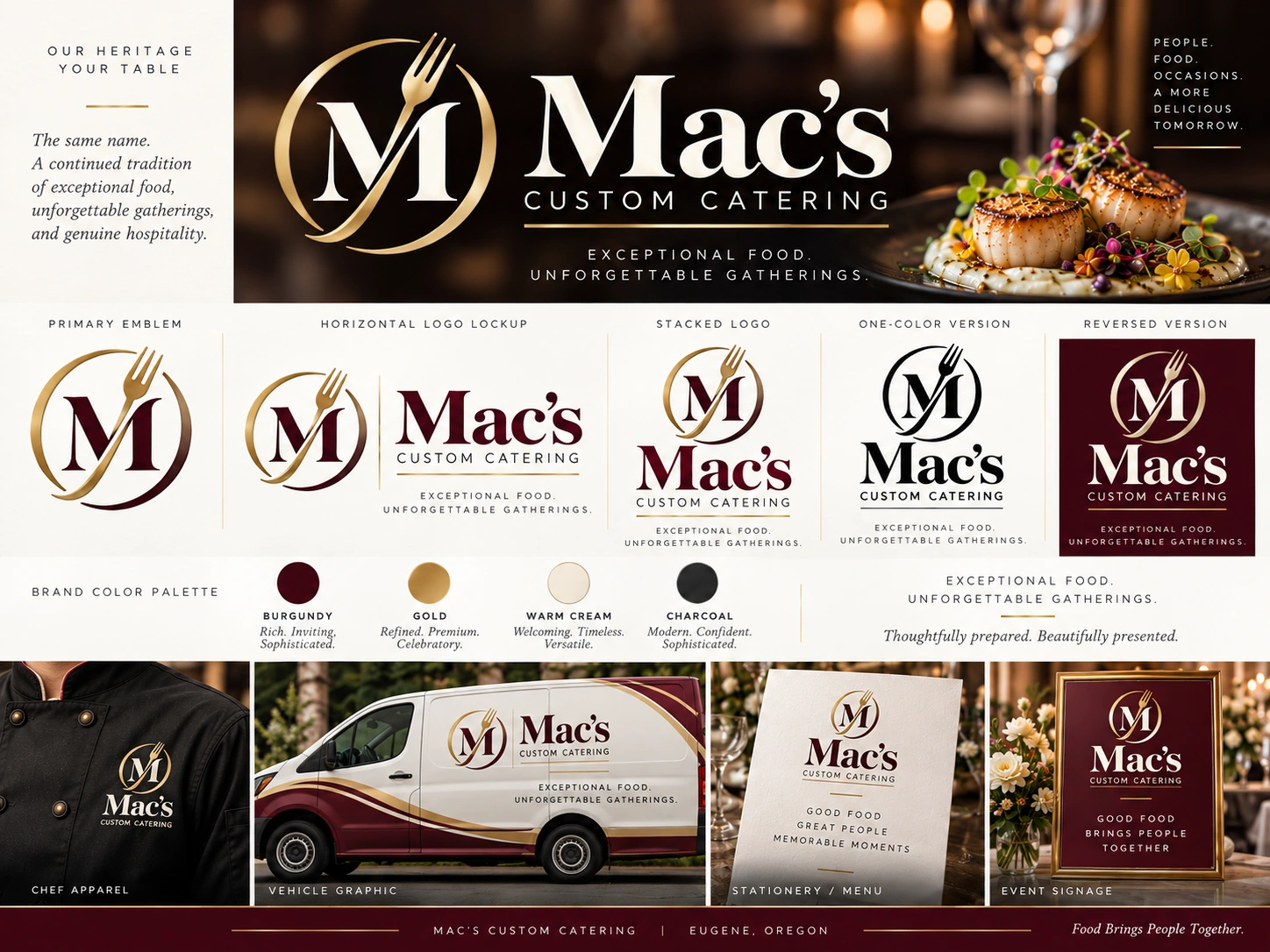
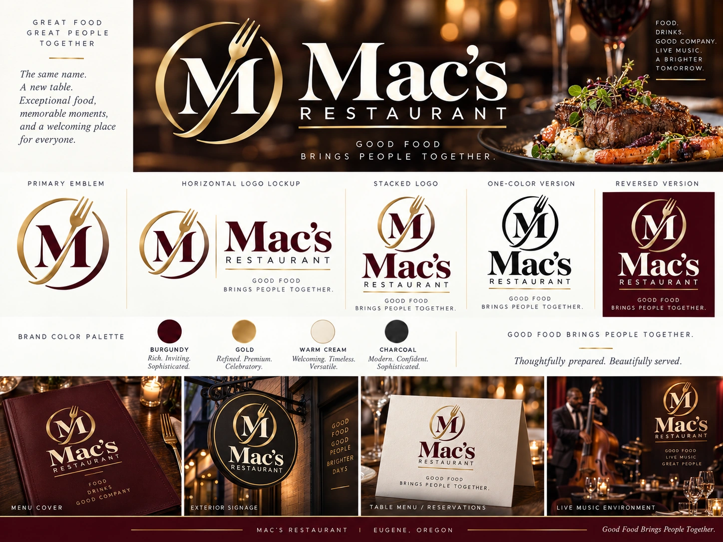
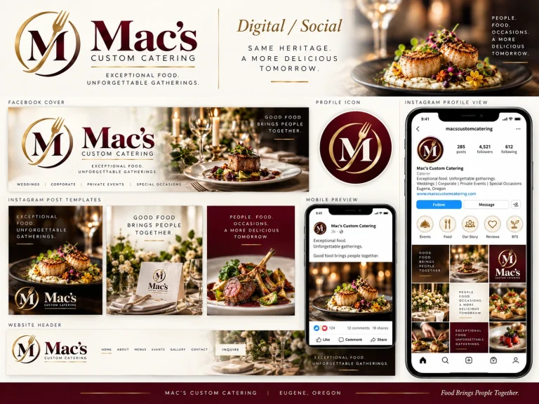
The proposed identity takes the familiar Mac’s name and builds a distinctive emblem around an M crossed by a subtle fork within a circular flourish. Rather than creating two unrelated brands, the same symbol pairs with 'Custom Catering' or 'Restaurant' in coordinated horizontal, stacked and single-color arrangements. Burgundy, warm cream, gold and charcoal create a welcoming hospitality palette. This is an optional evolution of the current identity, designed to make the two businesses feel connected while remaining easy to distinguish.
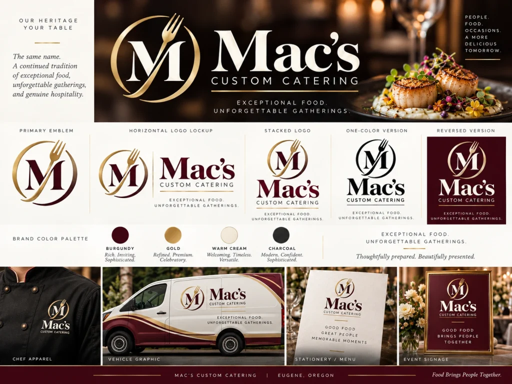
Two Lockups. One Mac’s.
The creative direction is presented as a coordinated brand family. Catering gets its own complete set of marks and branded applications; the restaurant receives a companion identity using the same emblem, typography and colors. The boards demonstrate the visual concept rather than final print-ready vector artwork, which would be prepared after approval and refinement.
Mac’s Custom Catering — Identity Family
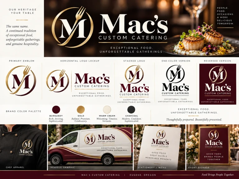
Mac’s Restaurant — Companion Identity
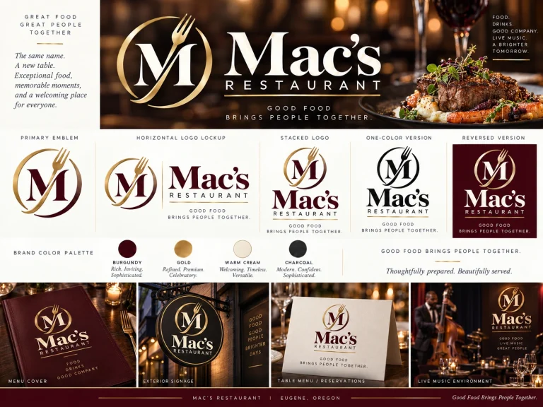
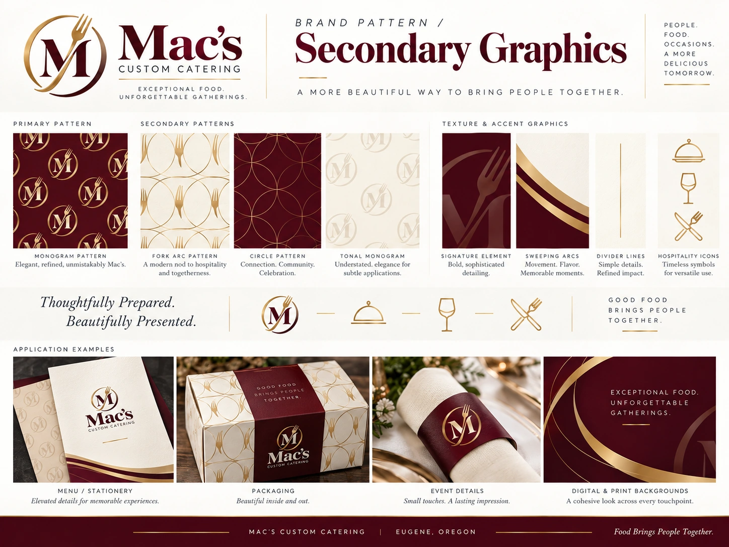
Signature Graphic Language
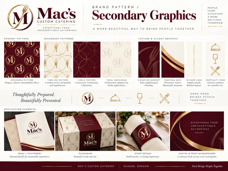
Color Palette
A Consistent Experience, On-Site and Online.
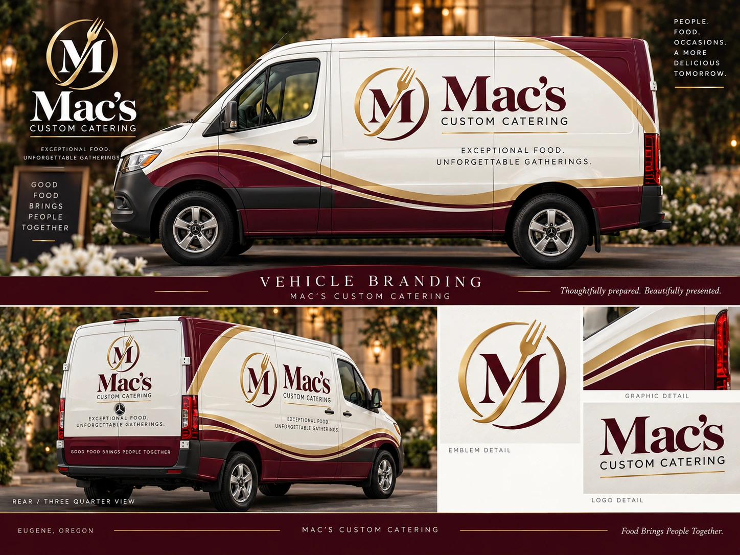
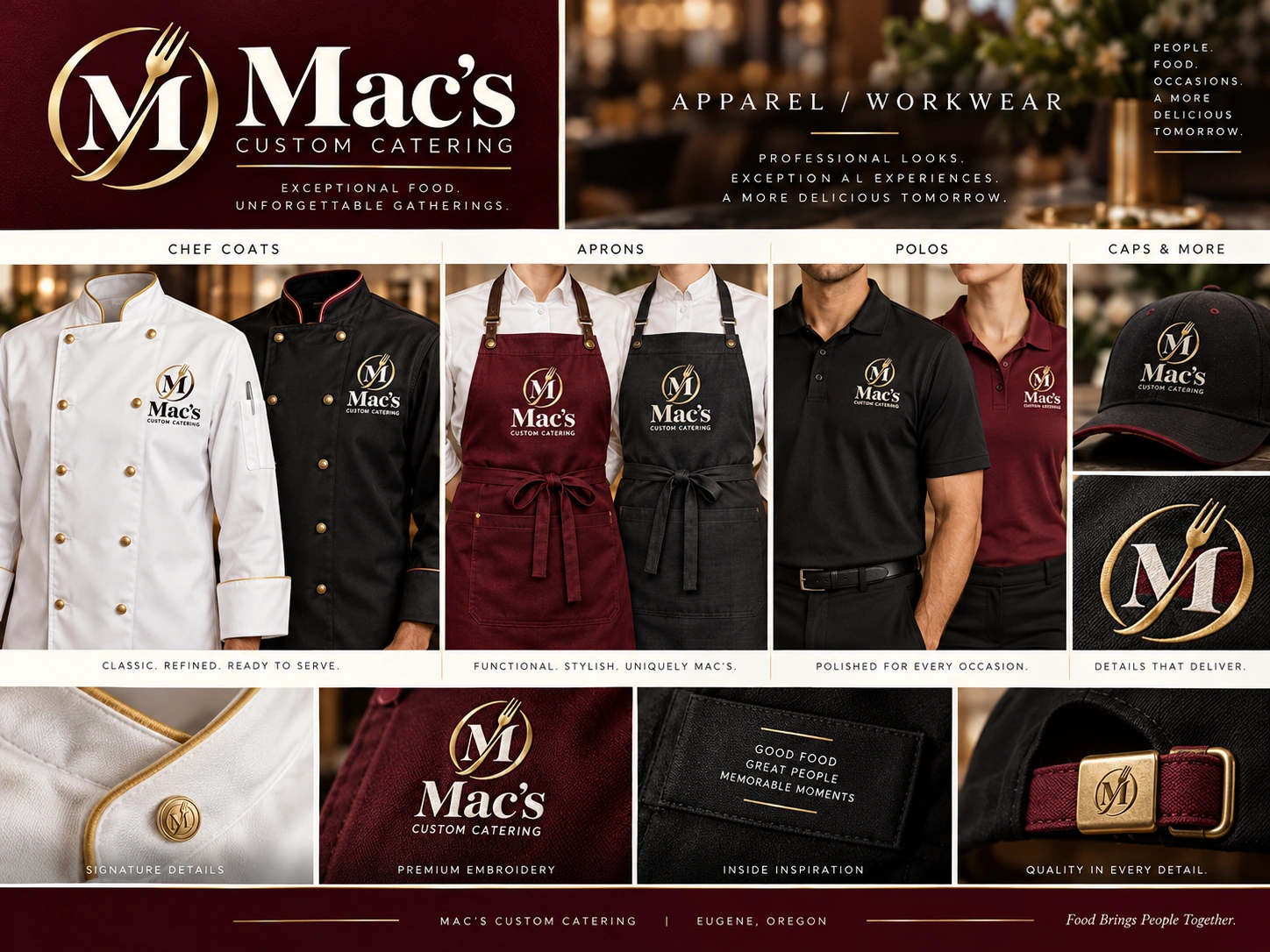
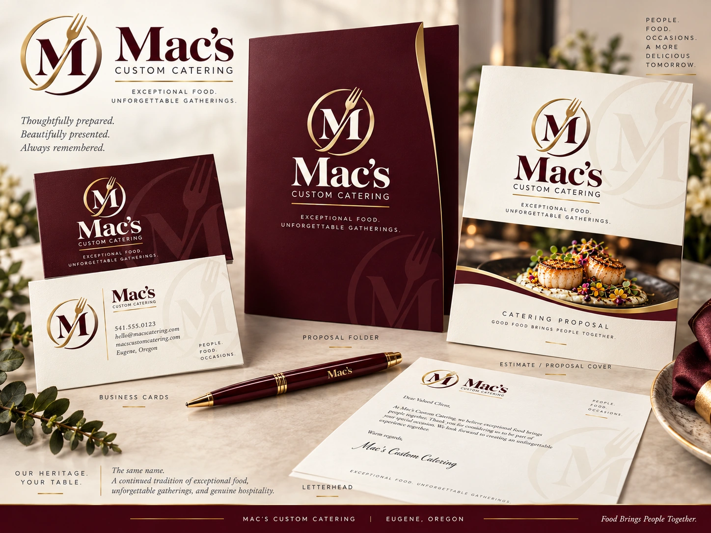
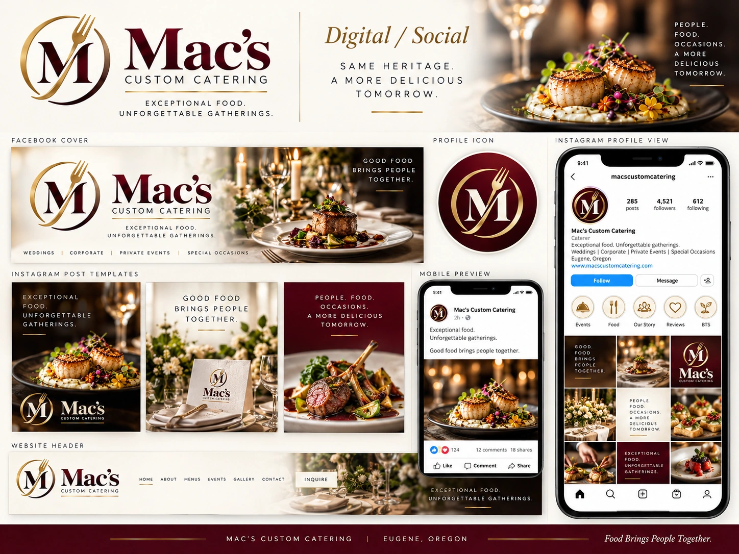
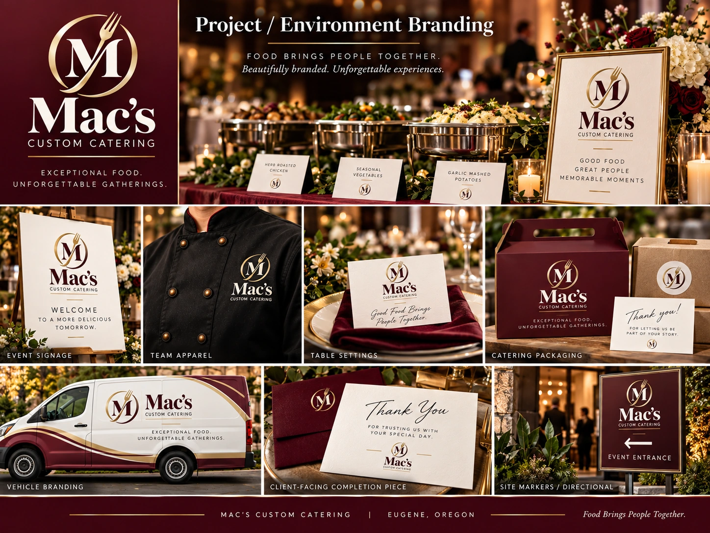
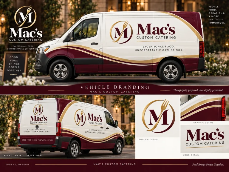
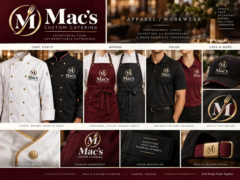
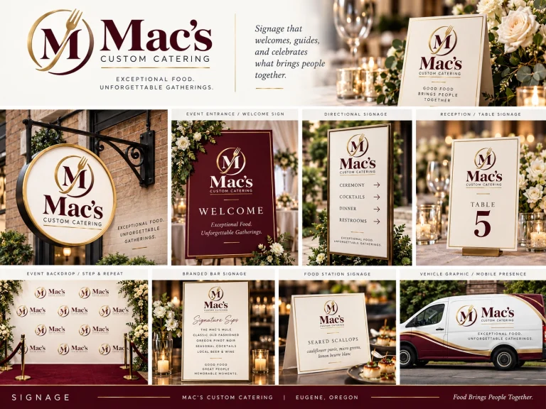
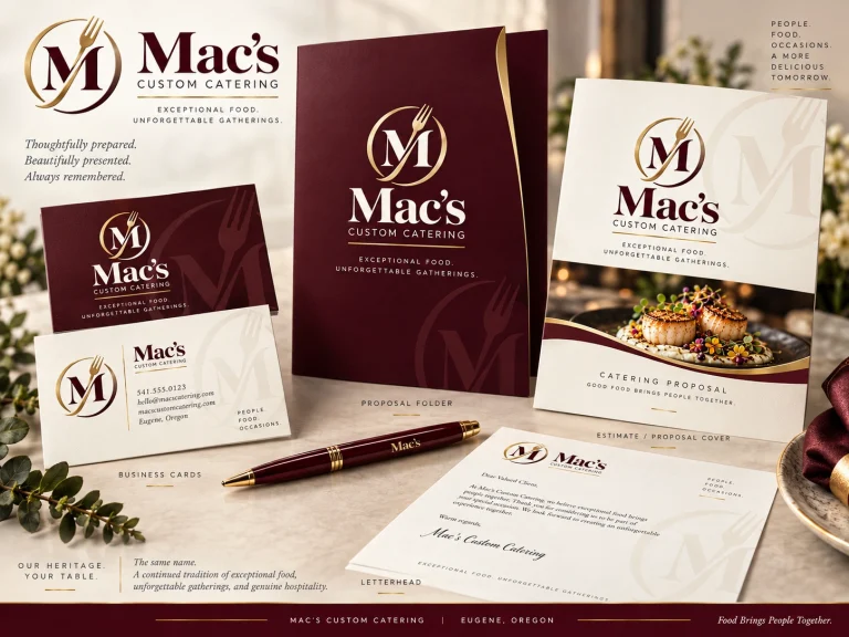
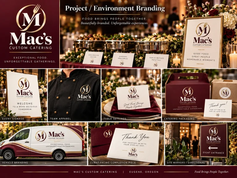
The following concepts show how the shared identity could appear in daily operations, event service, signage, printed materials and digital channels. The location images use photos of the existing building, so Patrick can picture proposed sign-face updates in the real setting. These visuals are illustrative; installing signs, printing materials, embroidering apparel or wrapping vehicles would be separate production decisions and costs.
A Refresh That Respects What’s Already There.
Recognizable
The name customers already know stays central, supported by a memorable emblem that works in large and small formats.
Coordinated
Restaurant and catering applications share a consistent foundation without pretending the two customer journeys are identical.
Flexible
The symbol and wordmark have horizontal, stacked and simplified uses for signage, uniforms, packaging and digital spaces.
Practical
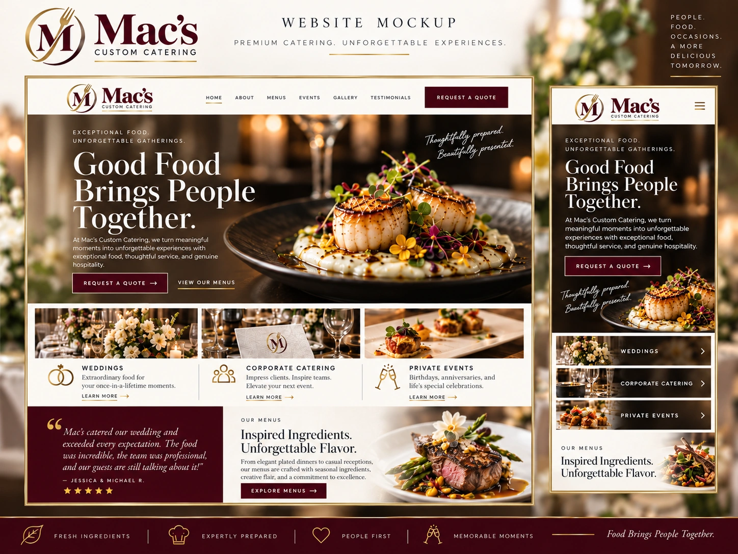
The website opportunity is tied to customer inquiries, catering selection and the existing ordering process—not visual change alone.
Phased
A catering-first website update can be prioritized while the restaurant website remains live and a later redesign stays optional.
Improve What Matters First.
Because the sites serve a business already operating day to day, the work should be staged thoughtfully. We can decide what improves customer experience most, minimize disruption to live ordering, and avoid spending on every physical application at once.
Confirm the Direction
Review the proposed M-and-fork identity with Patrick; refine the catering and restaurant lockups, final colors and practical use cases.
Audit Menus & Ordering
Map current WooCommerce products, pricing, options and workflows; choose whether checkout, a structured inquiry form or a hybrid process best matches how catering orders are fulfilled.
Redesign the Catering Experience
Build a responsive site centered on event types, menus, clear calls to action and the approved ordering or quotation process, with URL redirects and SEO continuity planned.
Extend at a Comfortable Pace
Supply approved identity artwork for signage and collateral. Consider a separate restaurant/live-music website refresh when timing and budget make sense.
Start With One Shared Identity and a Better Catering Journey.
My recommendation is to treat this as a collaborative next phase of our existing relationship, not a cold-start brand replacement. We can finalize one cohesive identity family for Mac’s Custom Catering and Mac’s Restaurant, then focus new web development on the catering experience where ordering and lead handling may benefit most. The restaurant/live-music site can continue as-is for now and adopt the companion logo, with a larger site redesign separately scoped later. We would review the actual ordering requirements and implementation budget together before setting a final fixed project price. Physical production is not included merely because its potential appearance is illustrated here.
- Refinement of the shared Mac’s visual identity
- Primary, stacked and horizontal catering lockups
- Matching Mac’s Restaurant identity lockups
- Emblem, single-color versions, palette and typography guidelines
- Design-ready artwork for approved signage and marketing applications
- Catering website content and conversion planning
- Review of current WooCommerce ordering and alternative form-based approaches
- Responsive catering website concept and functional development scope
- Migration, redirects and SEO preservation planning
- Optional future restaurant website redesign scoped separately
Let’s Talk About Mac’s Next Chapter.
I put this together because we already have a working relationship and I believe there’s an opportunity to make both sides of Mac’s feel even more connected—while making the catering experience easier for your customers. Nothing here needs to happen all at once. I’d love to hear what you think of the visual direction and, just as importantly, what would help the business most right now.