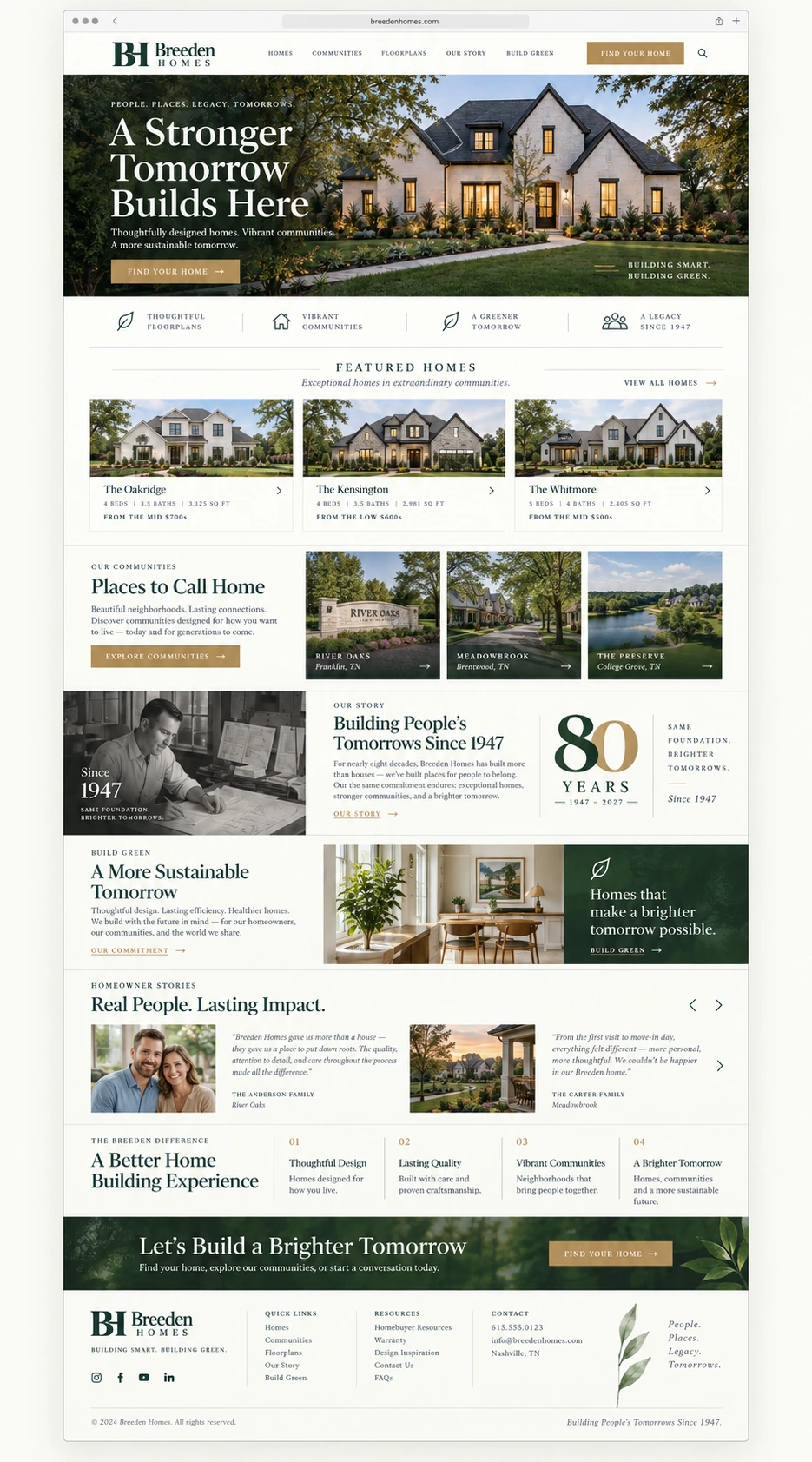
Eighty Years of Building Homes. A New Chapter for the Breeden Brand.
Having worked with Breeden Homes for years, I know this is much more than a website or a logo. It represents a family business, generations of experience, and the trust Breeden has earned since 1947. As the company approaches its 80th anniversary in 2027, I wanted to share a fresh creative direction that honors that history while giving the business a more cohesive identity and a website experience worthy of the homes it builds. This is an invitation to explore what we could create together—not a criticism of what has served the company well for years.
Eight Decades of Trust. One Remarkable Foundation.
Breeden Homes traces its beginnings to 1947 and describes a multigenerational commitment to building homes and neighborhoods in Lane County, Oregon. The current home catalog highlights flexible floorplan customization, energy-conscious choices, River Heights, and the people who help homeowners navigate the building process. These are real strengths. The opportunity is to organize the way that story is told—in the visual identity, sales materials and website—so customers immediately understand the difference.
A Family Legacy Since 1947
Breeden’s multigenerational building history is more than an anniversary talking point. It is an authentic reason for prospective buyers to trust the name, and it should be visible throughout the brand.
Homes, Floorplans & Neighborhoods
The catalog demonstrates a substantial collection of single- and multi-level plans, home renderings, interior photography and information about the River Heights neighborhood. These assets create a useful starting point for a richer digital browsing experience.
Personalization & Thoughtful Building
The catalog describes customizing proven plans, supporting buyers through selections and design refinement, and considering cost-efficient and environmentally conscious options. The new website should explain that process simply and visually.
An Identity That Has Evolved in Pieces
Breeden currently uses a green text-based website logo and a separate ornate gold arched emblem in its printed catalog. Both reflect different chapters of the business, but a consistent, flexible identity would make the name easier to recognize across every format.
Celebrate the First 80 Years. Design for the Next 80.
An 80th anniversary gives us a natural, positive moment to bring everything together. Rather than treating this as a break from the past, we can carry the Breeden name and values forward with a more distinctive visual mark and a thoughtfully rebuilt website. Because Breeden is already an existing client, we can also begin with the content, imagery and site structure the business has invested in over the years, instead of treating the project like a complete restart.
A New Signature for a Familiar Name.
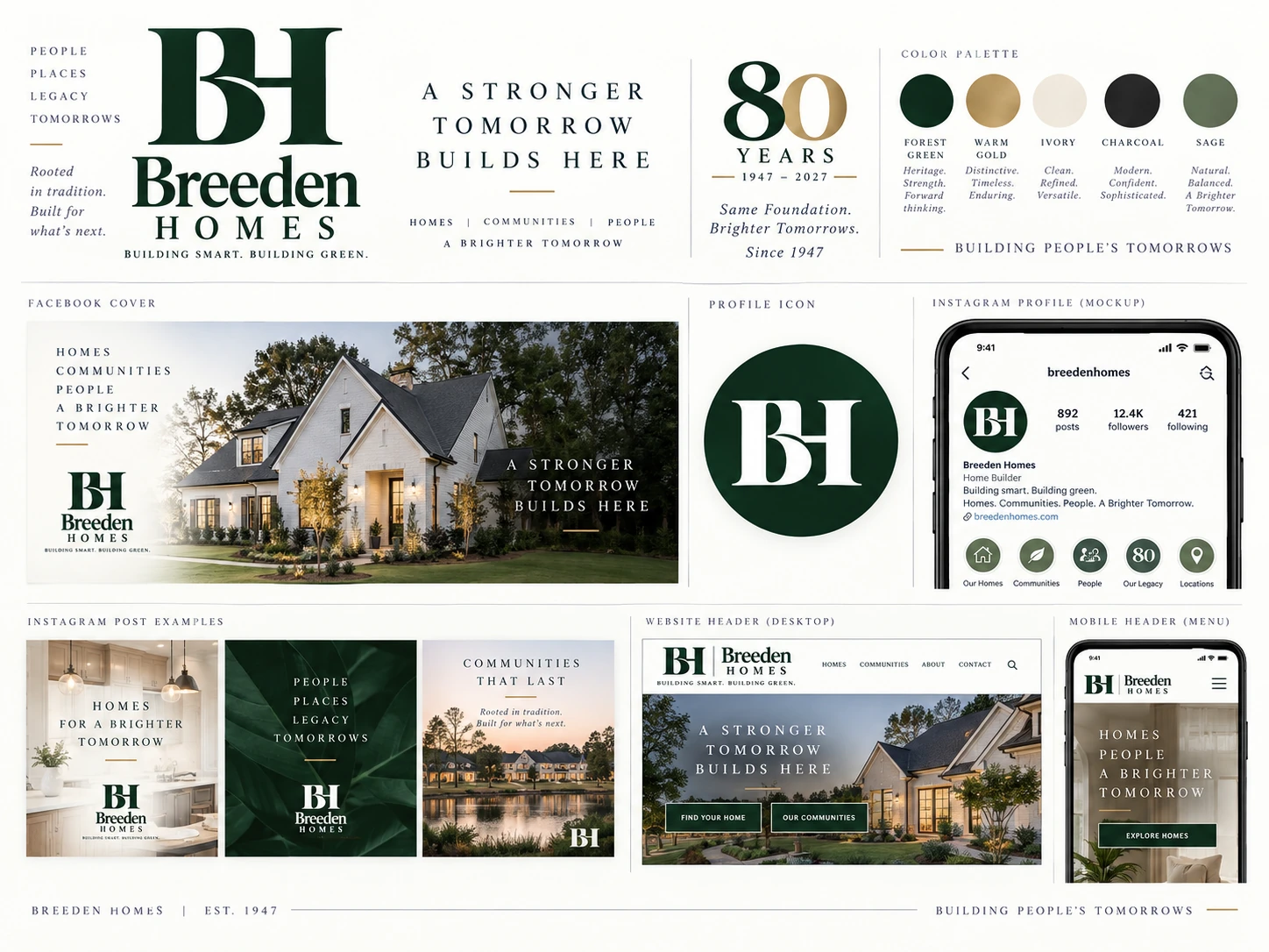
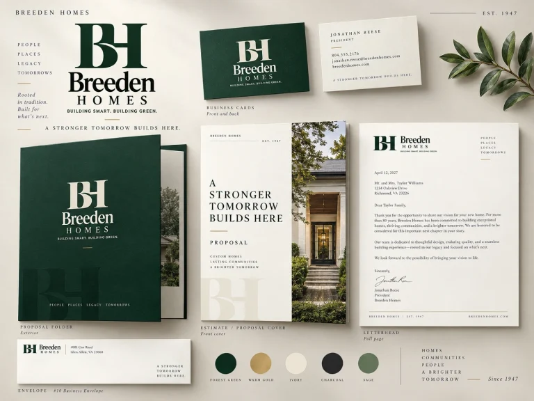
The proposed BH monogram is built around the two initials customers already associate with Breeden Homes. Its integrated letterforms are substantial, elegant and easy to carry from a small social avatar to a prominent neighborhood sign. The refined Breeden Homes wordmark keeps the name at the center, while forest green, warm gold, ivory and restrained secondary colors bring warmth and sophistication. It is a proposed evolution—not a requirement to discard what customers recognize. The separate 80 YEARS / 1947–2027 mark celebrates the milestone without making the main identity temporary.
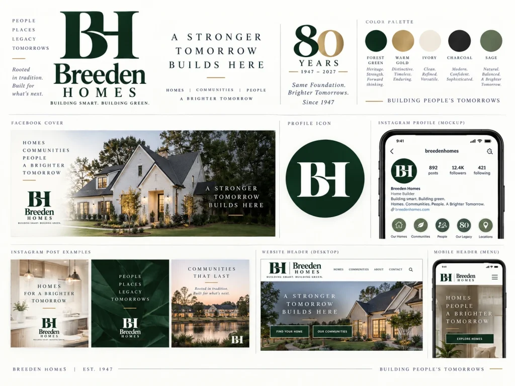
One Family Name. One Cohesive System.
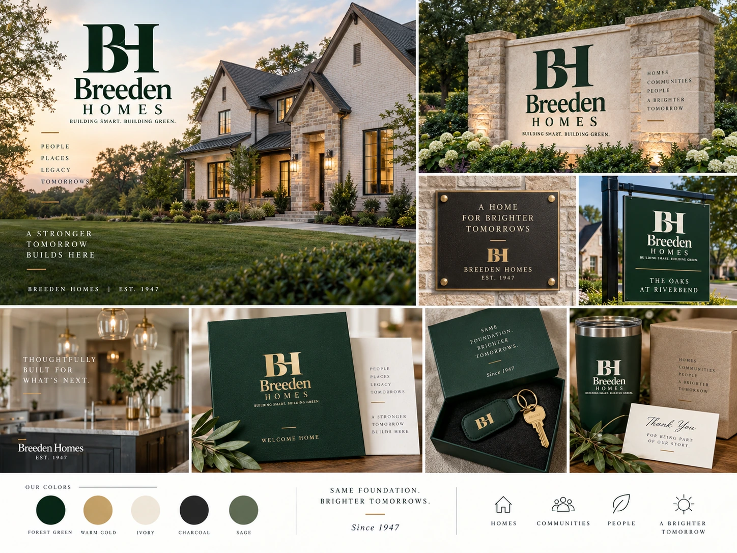
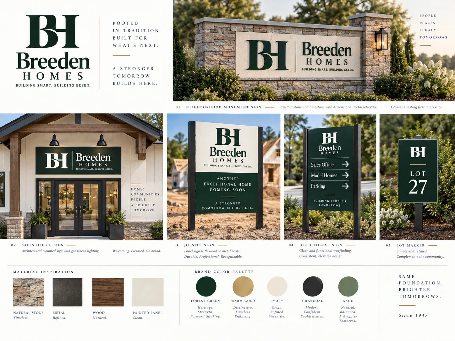
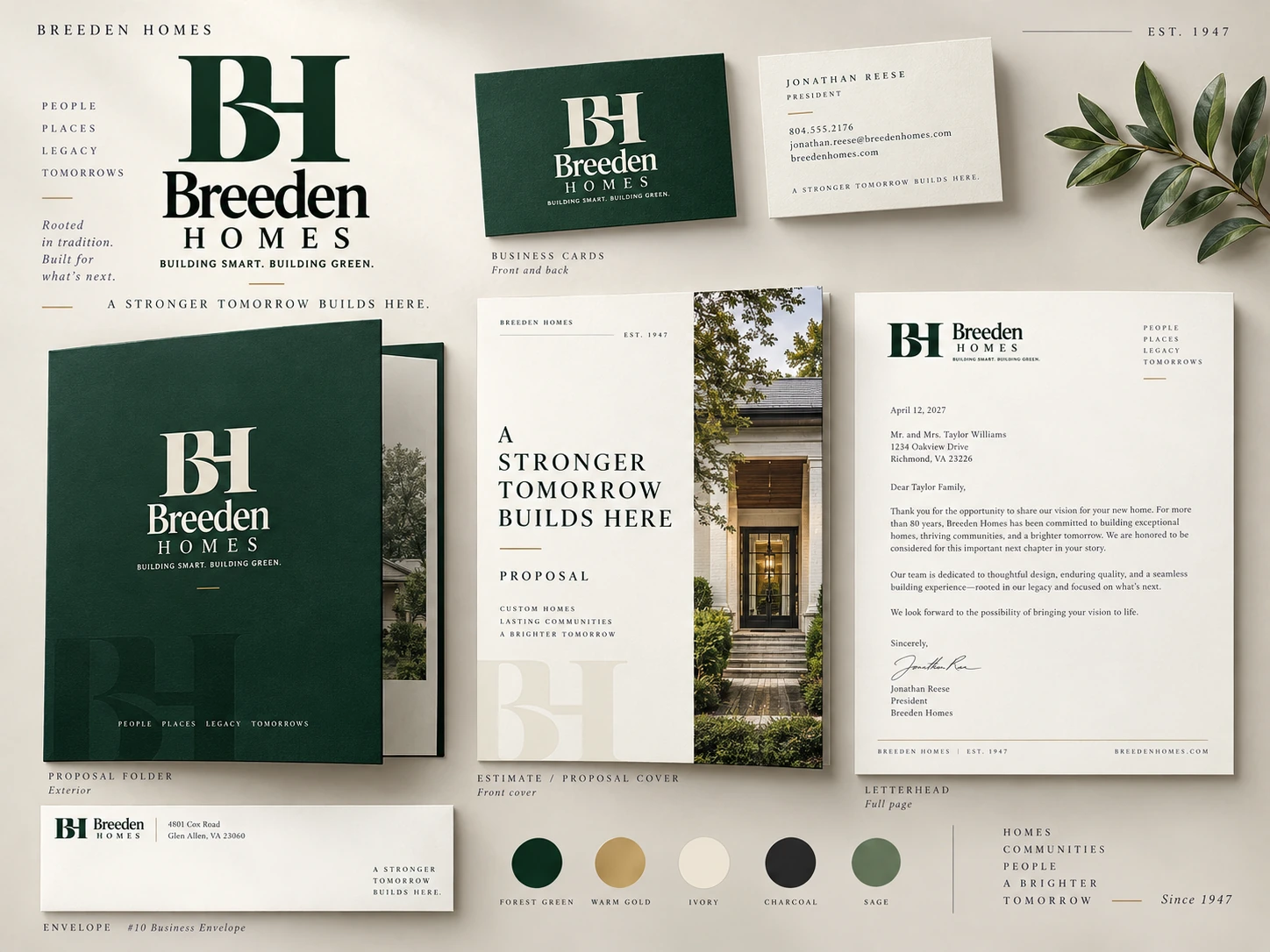
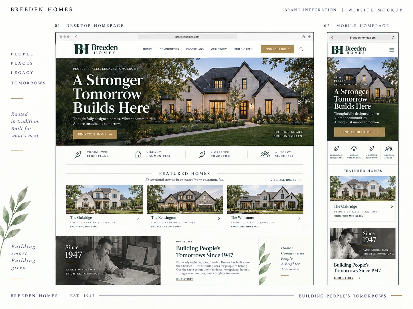
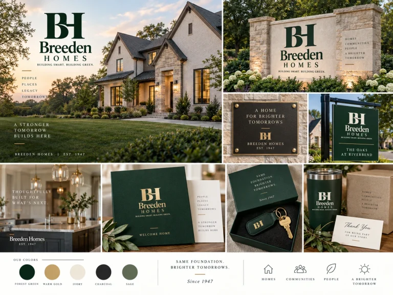
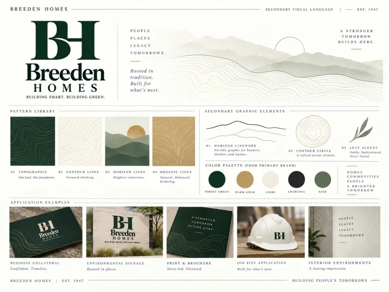
The artwork illustrates how the BH symbol, Breeden Homes lettering, anniversary element and supporting graphic language can work together. The same principles apply to a small embroidered mark, a full-size sign, a printed proposal, and the top of the new website. These images are creative concepts; final production artwork, verified copy and real property photography would be prepared together during implementation.
Core Identity & Digital Expressions
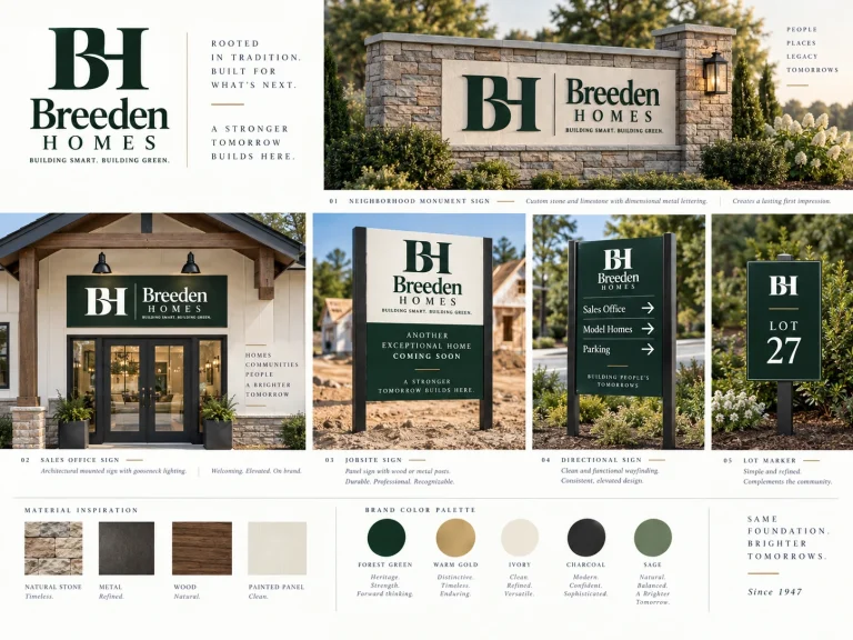
Heritage in the Built Environment
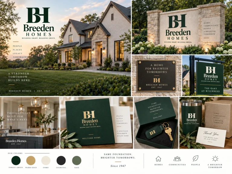
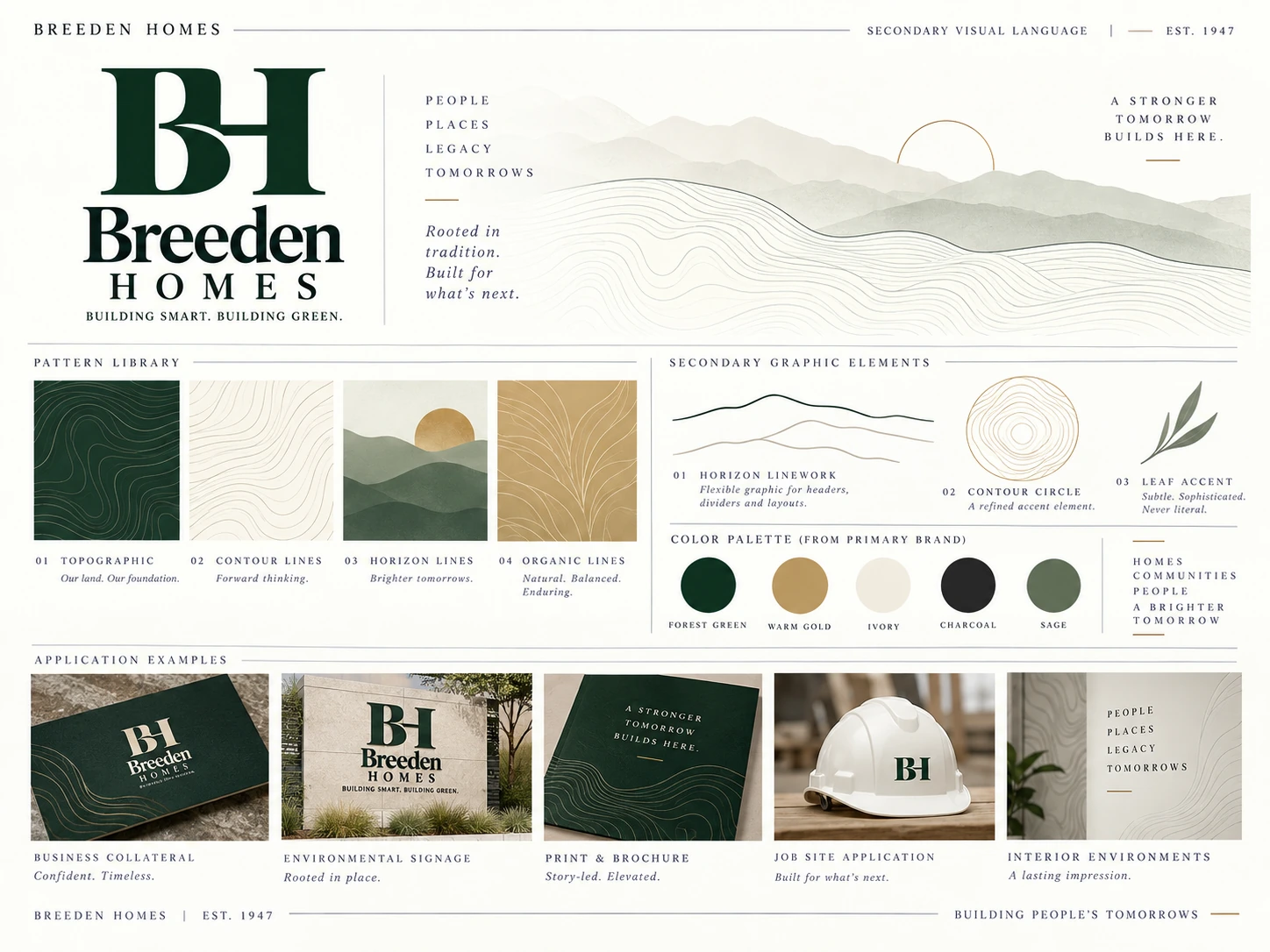
Supporting Patterns & Graphic Language
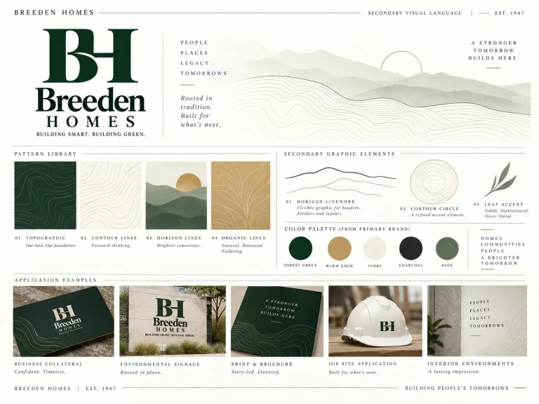
Color Palette
A Consistent Look Wherever Breeden Is Seen.
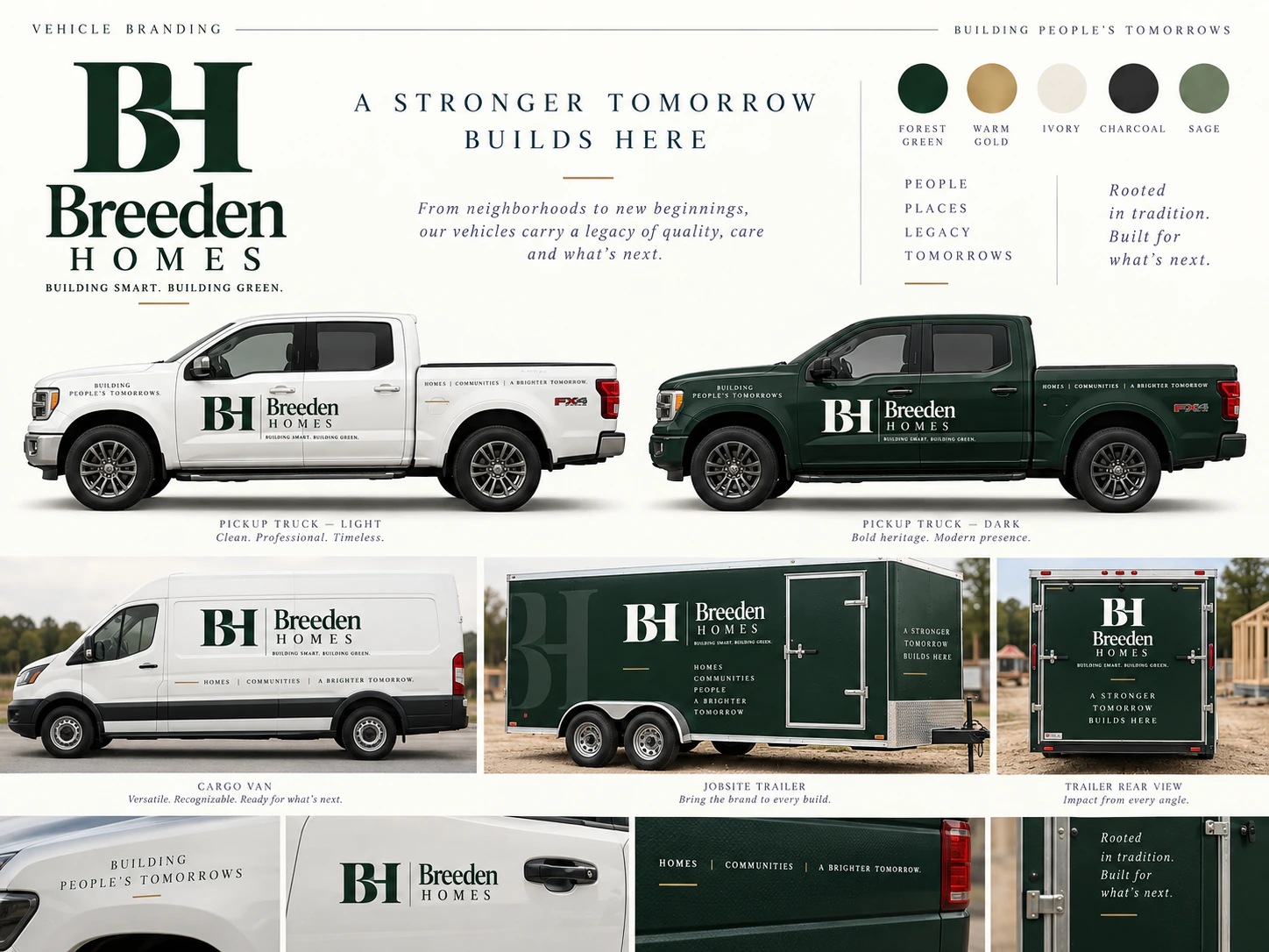
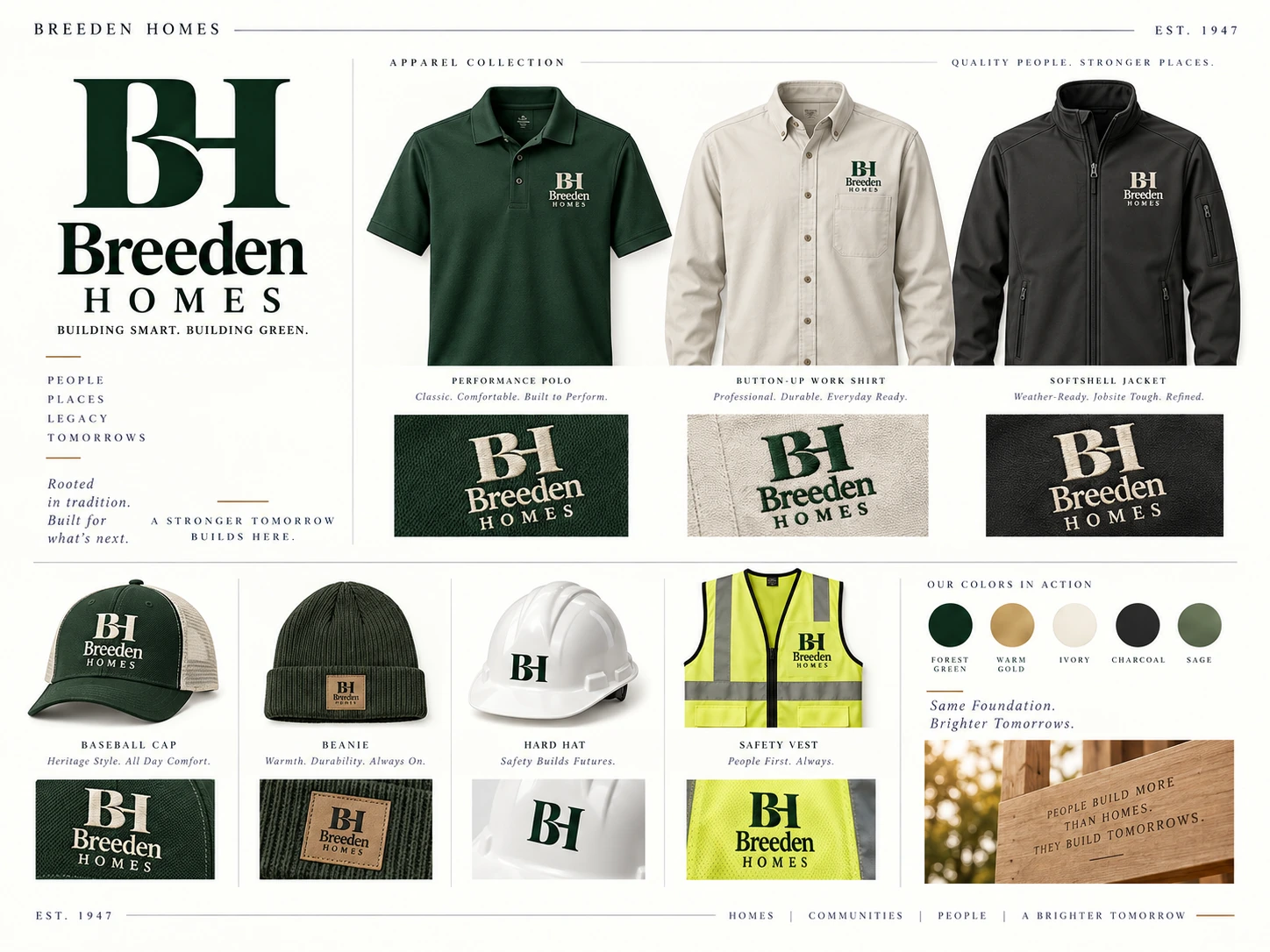
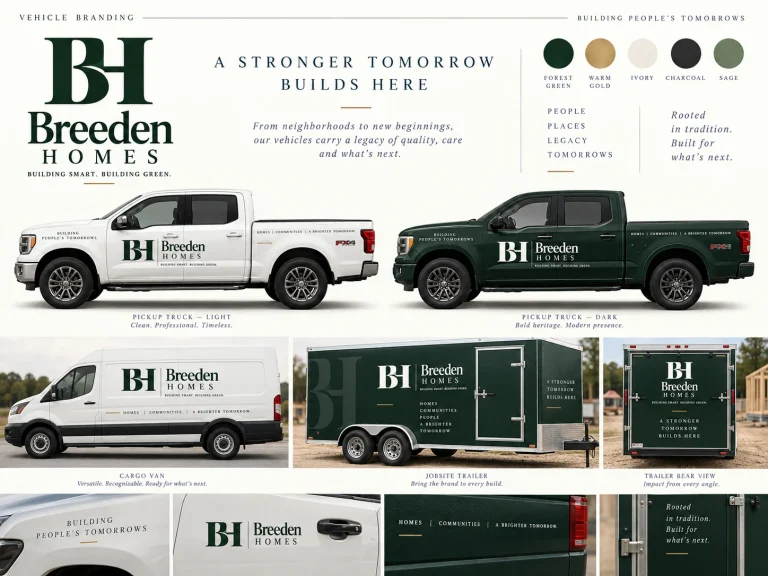
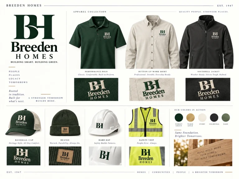
Rather than selling a standalone logo in isolation, these mockups show what the Breeden identity could become across the touchpoints homeowners experience: construction-site visits, neighborhood entrances, conversations with the team, printed proposals, social channels and property browsing. They illustrate possibilities, not a requirement to replace every physical asset immediately. A phased rollout can prioritize the items that are most useful to Breeden.

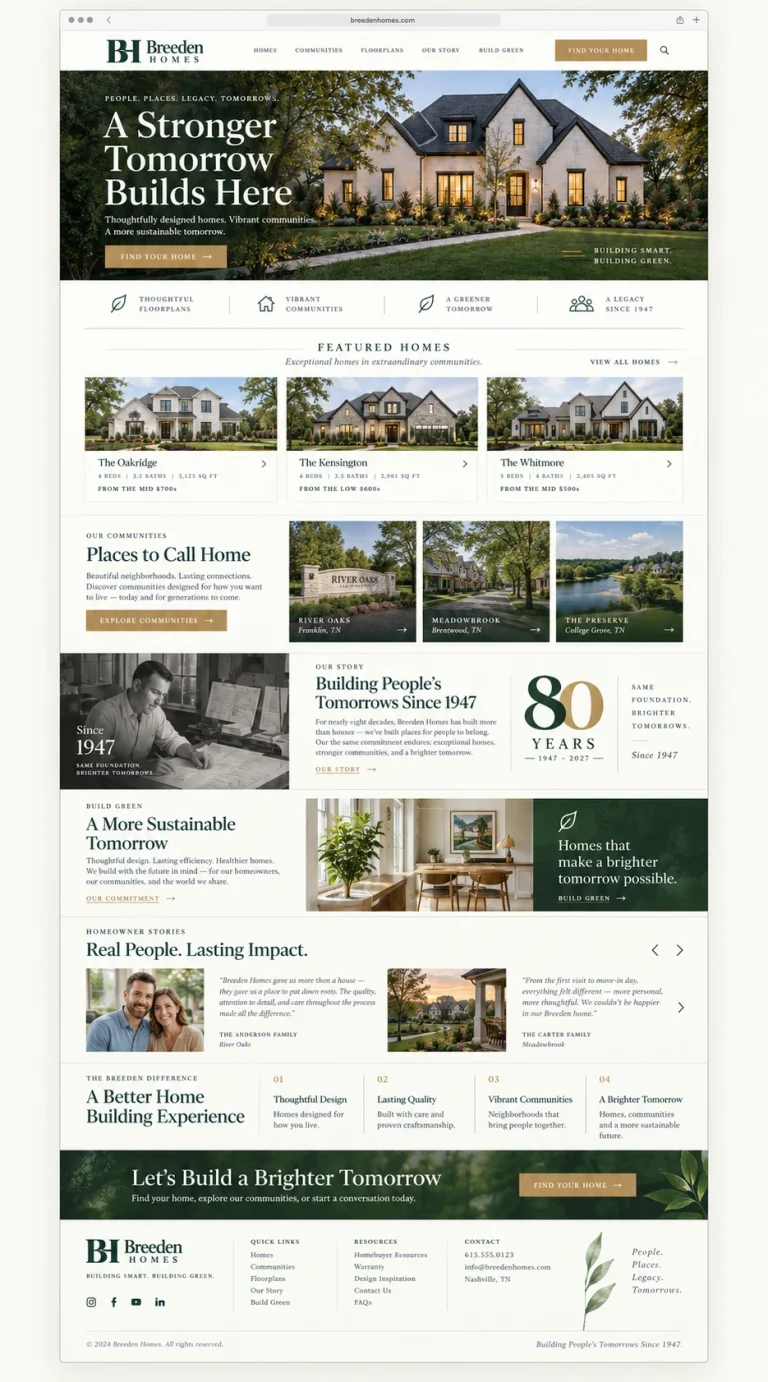
Modern in Presentation. Enduring in Character.
True to Breeden
The primary emphasis remains on the Breeden name, the family story, the homes and the neighborhoods—not a fashionable symbol unrelated to the business.
Distinctive at a Glance
The interlocking BH provides a recognizable visual shorthand for social icons, workwear, construction signage and more without requiring a lengthy wordmark everywhere.
An Anniversary With Meaning
The 80-year mark gives 2027 a clear celebratory theme, while the permanent identity continues to make sense in 2028 and beyond.
More Useful Home Browsing
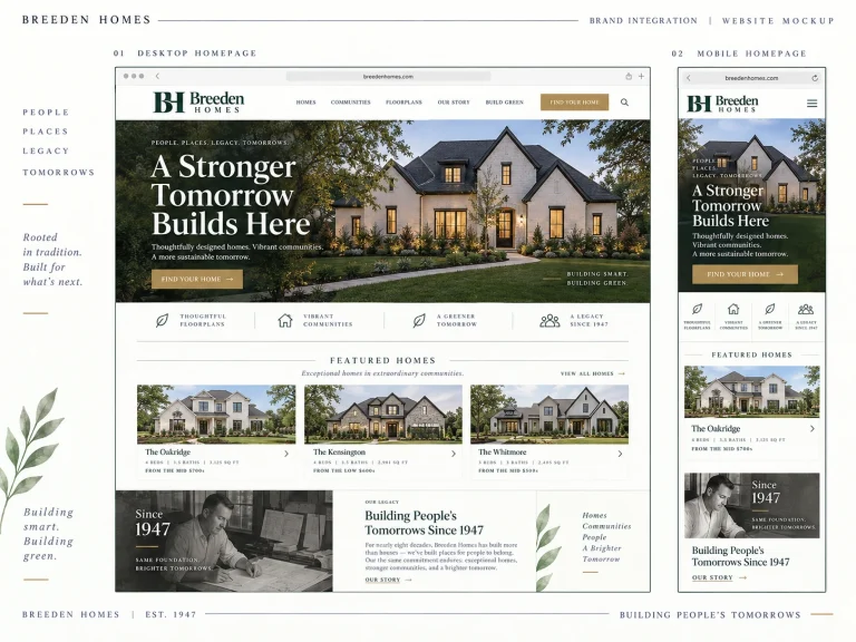
A modernized home and floorplan presentation could help visitors compare designs, navigate neighborhoods and understand how to take the next step.
Built From What Already Exists
Breeden’s current imagery, content and data are assets worth evaluating and migrating selectively; continuity also matters for existing URLs and search visibility.
A Thoughtful Upgrade, Not an Unnecessary Restart.
Since I was involved in developing the existing site, we have a practical advantage: we can examine its current theme, WordPress database, media, floorplans and property structures before committing to a new implementation. The goal is a faster, clearer, easier-to-manage experience built on sound information architecture, with a staged transition that protects the existing site while the replacement is developed and tested.
1. Confirm the Brand Direction
Review the BH monogram, stacked and horizontal logos, color system, anniversary treatment and how best to respect the recognition Breeden already has.
2. Audit the Existing Website
Export and review the existing WordPress database and theme in a safe working environment; inventory home listings, floorplans, neighborhoods, images, content, forms and URL structures.
3. Design & Develop the New Experience
Build the approved responsive design around real Breeden homes and photography. Reuse and restructure existing information where sensible, and confirm any custom filters or integrations before implementing them.
4. Review, Test & Launch
Validate content, accessibility, mobile behavior, performance, forms and redirects. Launch carefully, then introduce the approved identity into priority print and digital materials.
A Fresh Chapter for a Longtime Client.
My recommendation is to bring Breeden’s visual identity and website together as one cohesive project, celebrating 80 years of homebuilding while preparing the company for the generations ahead. Having worked with you for so many years, I know the history behind your website and the investment you've already made in it. Rather than starting from scratch, we can build on that foundation, preserve the valuable content and information already in place, and transform it into a modern, professional experience. Together with the new brand identity, this will give Breeden Homes a consistent, recognizable presence across your website, marketing materials, vehicles, signage, and more—all as part of one complete brand and website redesign package.
- Brand direction, identity refinement and positioning
- Primary BH monogram and Breeden Homes logo lockups
- Color palette, typography and basic logo usage guidance
- 80th-anniversary mark and supporting campaign direction
- Responsive website visual design and WordPress development
- Content architecture for homes, floorplans, neighborhoods and company story
- Assessment and selective reuse of existing site content and media
- Core on-page SEO continuity and launch redirect planning
- Contact and home-inquiry user experience
- Mobile/responsive QA and launch testing
- Conceptual brand application previews for future rollout
Let’s Make the 80th Year the Beginning of Something New.
We've worked together for years, and I would love the opportunity to help bring Breeden’s next chapter to life. Take a look at the visual direction and website concept, and when you're ready, we can sit down together, talk about what you like, review the existing site and decide what would create the most value for Breeden. There is no need to change what makes the company who it is—only an opportunity to present it in a way that feels as strong as the legacy behind it.