A Trusted Name. A More Distinctive Identity.
Parker Inspections already has something that cannot be designed into existence: a local reputation built through the actual inspection experience. With new ownership since 2024, a personal approach to clients and services spanning homes, new construction and commercial properties, Parker has a compelling story to tell. This private concept explores how a more cohesive visual identity could express that trust across every encounter—without losing the personable character that makes Parker memorable or requiring a replacement of its existing website.
The Service Is Personal. The Stakes Are Serious.
Parker serves customers making consequential property decisions. The current website already provides a clear starting point—service information, scheduling prompts, owner introduction and contact options—so the proposed opportunity centers on visual consistency rather than declaring the site inadequate. The business also has a distinctive, owner-led customer tradition that can remain an asset without defining its entire professional identity.
A Business Entering Its Next Chapter
Ownership changed in 2024, and owner Andy Cheatham describes more than 15 years of construction-industry experience. A carefully considered brand evolution can express the current leadership and the company’s future while retaining the Parker name.
More Than Residential Inspections
Parker advertises residential, commercial, new-construction, pre-listing and follow-up services. A narrow house-only visual shorthand undersells the breadth of properties and audiences the company serves.
An Existing Digital Foundation
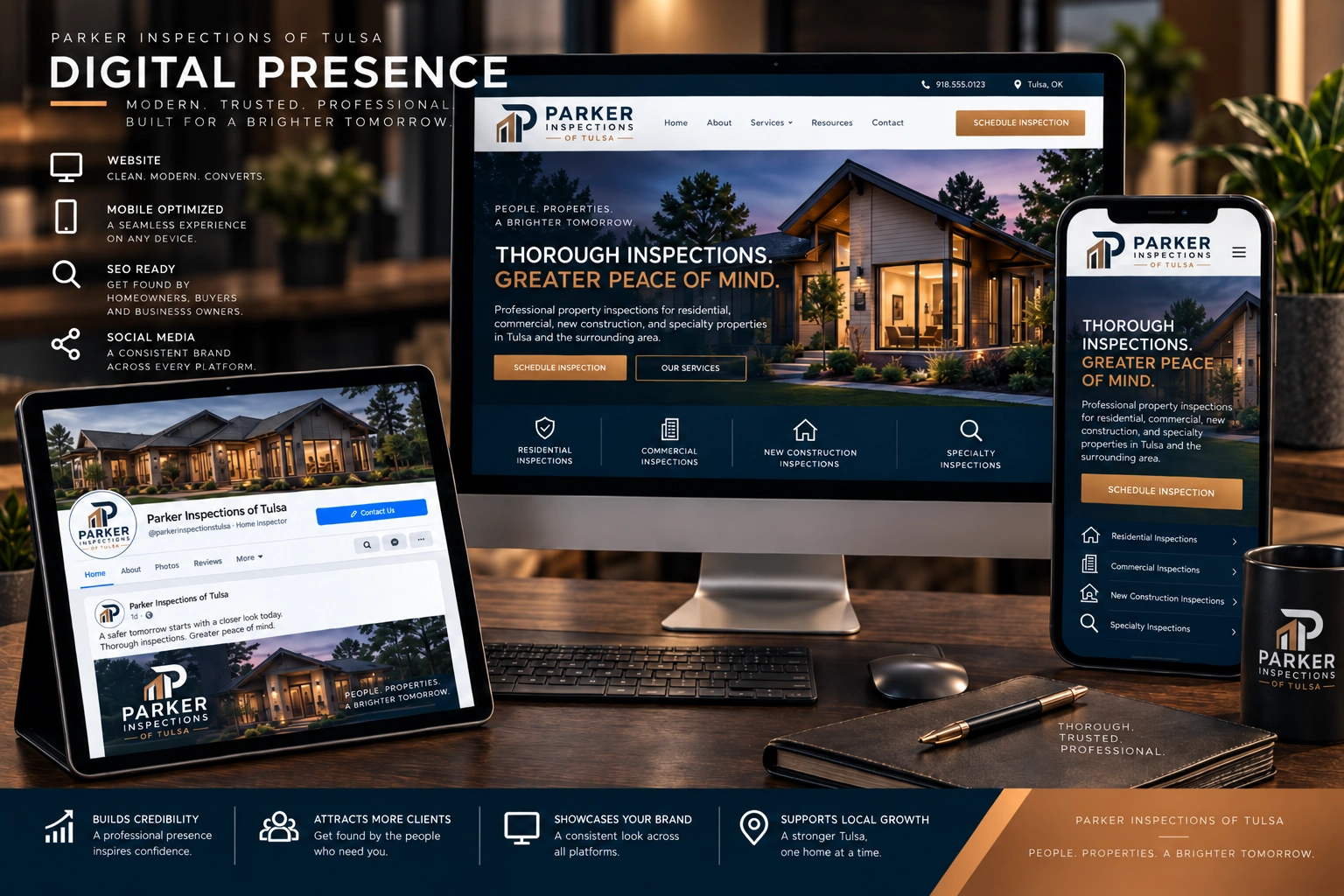
Parker’s website presents its services, owner story, contact information and inspection-scheduling pathway. A logo and supporting visual-system update can be introduced into that experience without assuming an expensive rebuild is needed.
A Memorable Customer Ritual
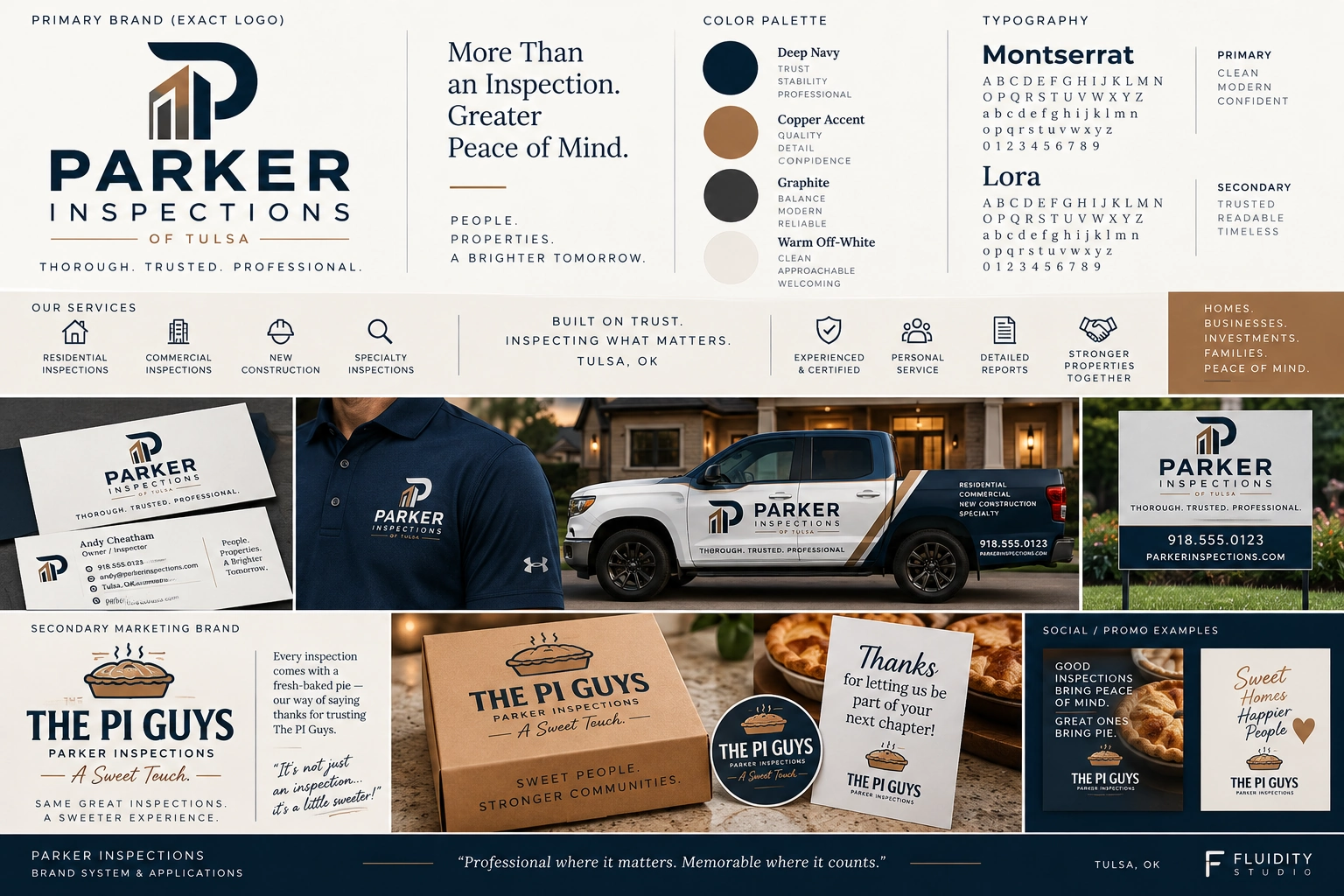
The owner has promoted “The PI Guys” and the practice of bringing a pie to inspections. That warm personal touch can become a distinctive secondary customer-experience campaign while the main company identity stays focused on accuracy, professionalism and trust.
Put Professional Confidence First—and Personality Where It Shines.
For a buyer, homeowner, real estate agent or commercial client, an inspection is about informed decisions and peace of mind. Parker’s public-facing identity can communicate that seriousness immediately, while its pie tradition provides the human detail clients remember afterward. Rather than forcing those two jobs into one symbol, the proposed system gives each a clear purpose.
An Architectural P. A Clearer Expression of Trust.
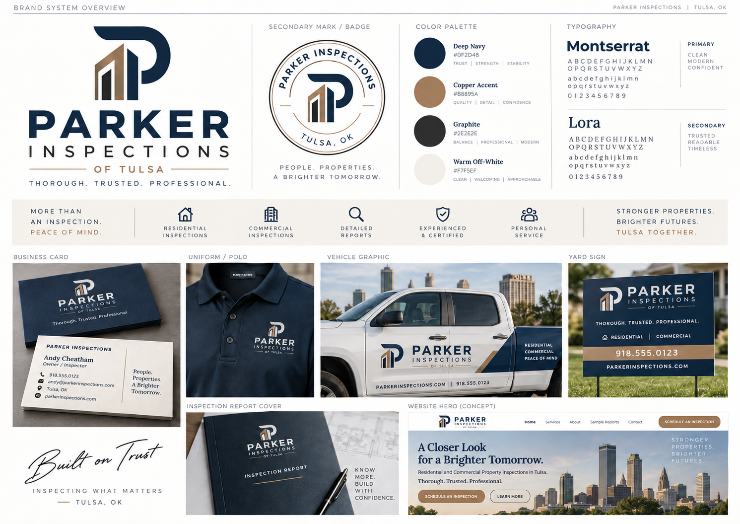
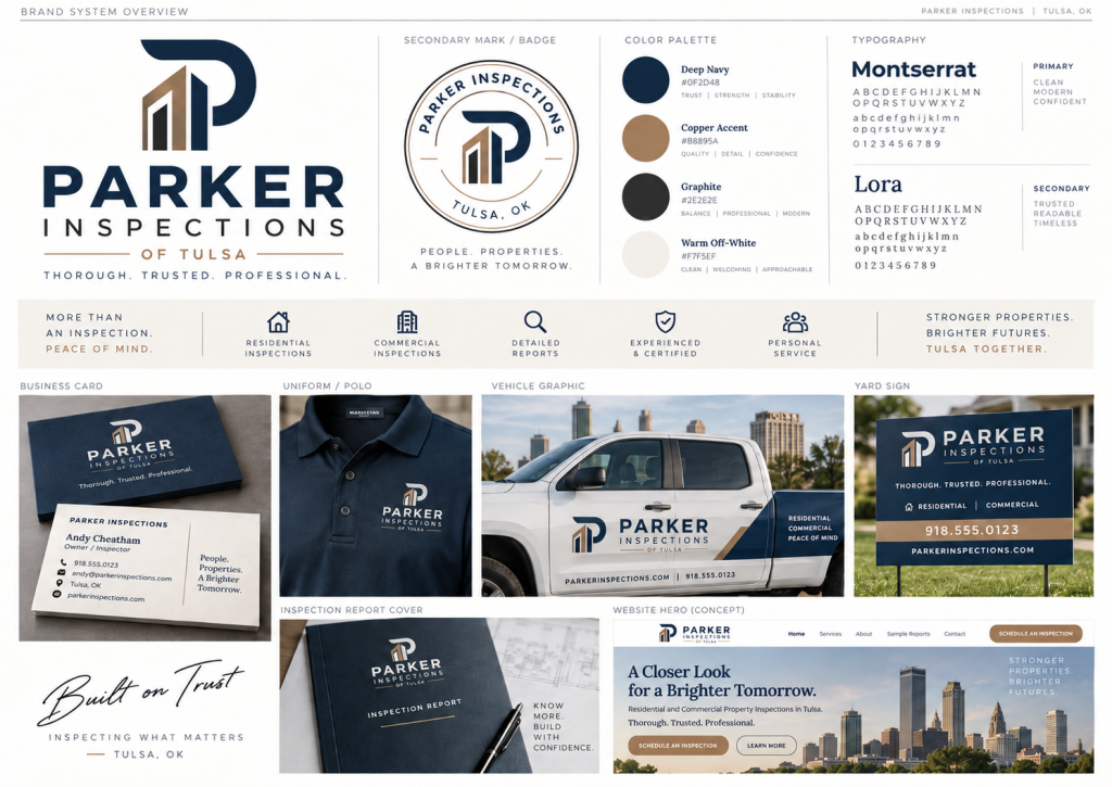
The approved concept pairs a confident Parker wordmark with a carefully structured P monogram containing architectural forms. It suggests the built environment without reducing the company to a cartoon roof or to a pie metaphor. The deep-navy foundation and warm copper details feel professional on inspection reports and uniforms, while the lighter neutral backgrounds keep the system approachable. This is an optional brand direction for Parker to consider—not a claim that its current visual identity or customer tradition must be abandoned.
One Recognizable System. Two Complementary Voices.
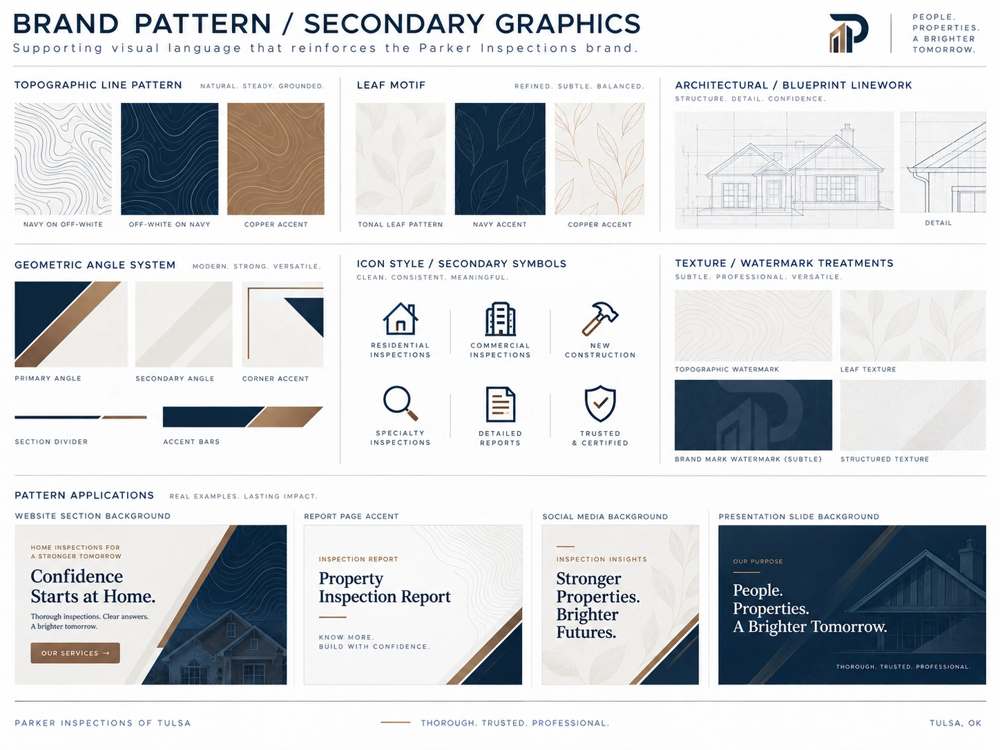
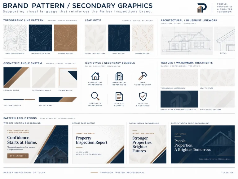
Parker’s core identity should always lead on professional materials: business communications, formal reports, vehicles, apparel and the website. Supporting graphics add structure without competing with the logo. A distinct PI Guys campaign can live on pie boxes, gift labels, thank-you cards and occasional social posts—so the owner’s client experience remains visible while the inspection company itself presents with authority. The PI Guys remains a distinct customer-appreciation campaign rather than an alternative to the architectural P.
Approved Parker Identity and Brand Standards
Patterns, Architectural Linework and Secondary Graphics
Color Palette
Professional Wherever Parker Shows Up.
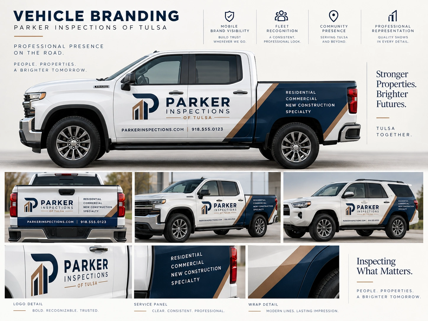
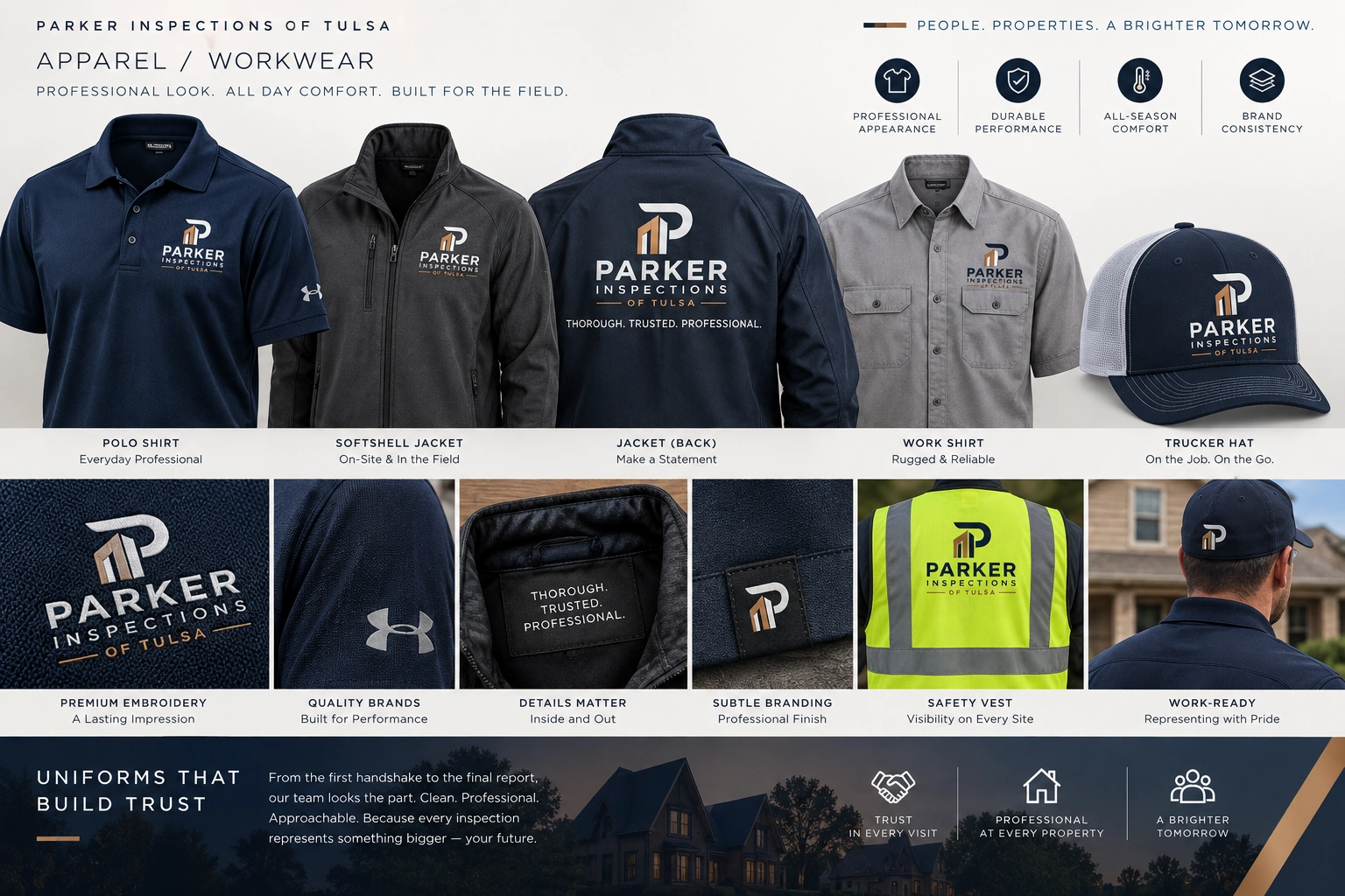
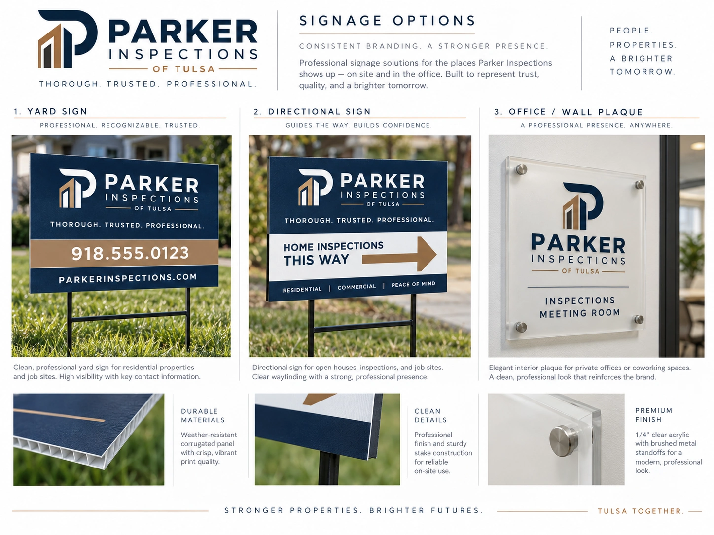
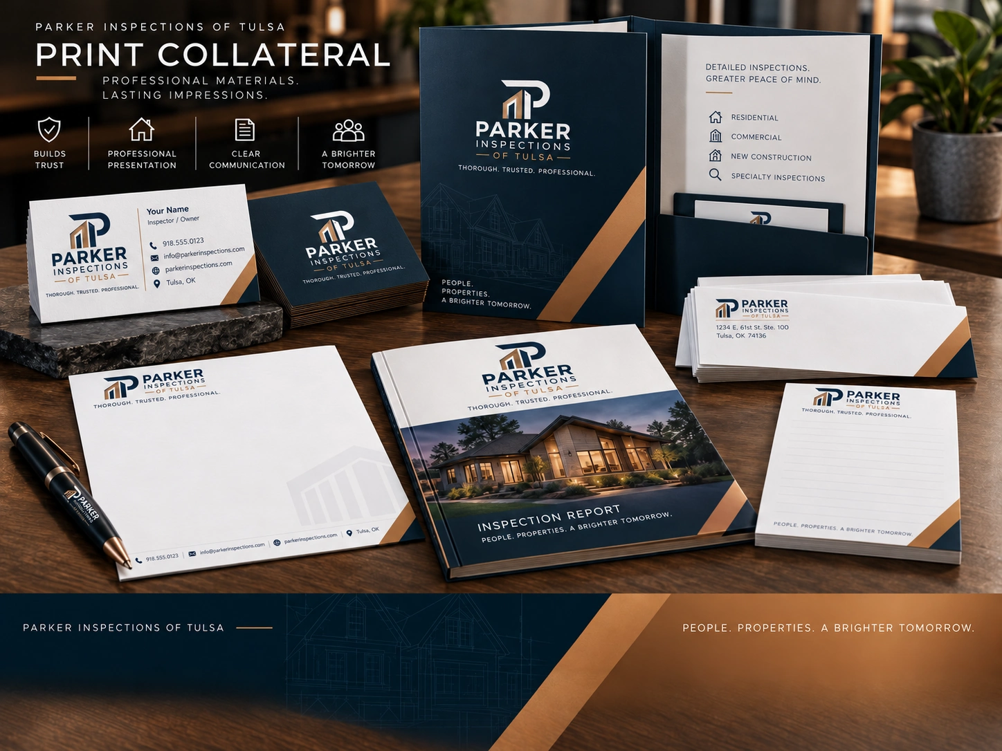
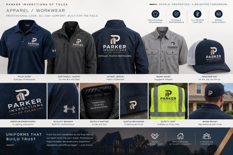
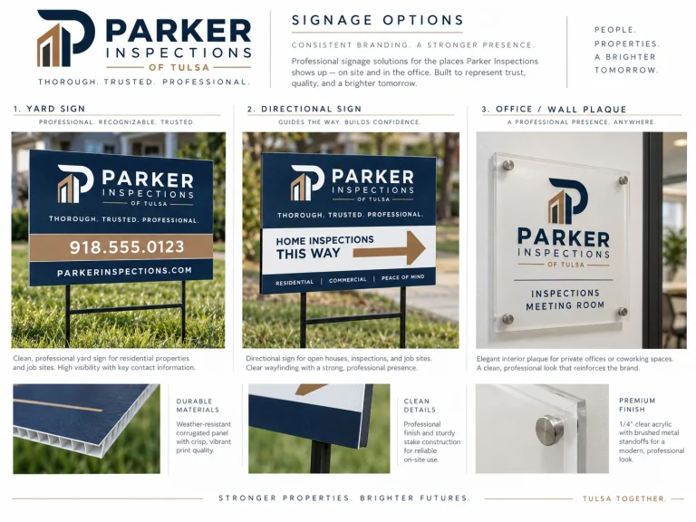
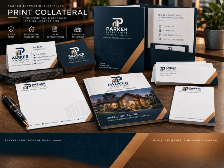
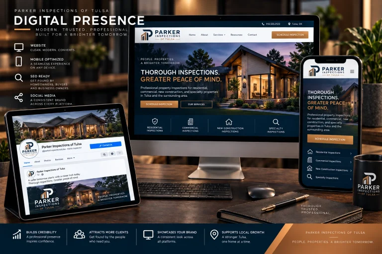
The strongest use of this identity is repetition at practical customer touchpoints—not a costly, wholesale replacement of everything Parker already owns. These mockups demonstrate how the same visual signature can appear on the road, in the field, in customer documents and in online channels. Signage is intentionally limited to portable staked signs and small indoor plaques; the Regus coworking arrangement does not justify assuming exclusive building or storefront signage rights. The PI Guys pie-gifting tradition remains a separate client-appreciation marketing opportunity; the primary inspection logo stays professional and pie-free.
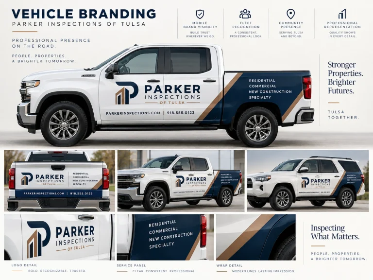
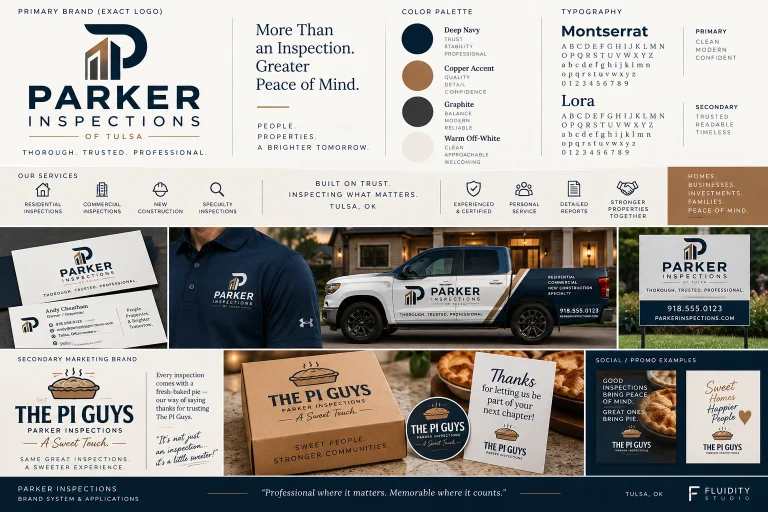
Serious About the Inspection. Memorable in the Experience.
Trust at First Glance
An ordered architectural mark and restrained palette help Parker look at home on professional inspection findings, proposals and commercial-facing materials.
Recognition Across Channels
Repeated use of the same monogram and colors makes it easier to connect a branded vehicle, inspector shirt, property sign and digital profile to the same Tulsa business.
Room for Personality
The pie tradition does not need to be erased. It becomes a signature client-experience touchpoint, while the main logo communicates the company’s primary service.
Cost-Conscious Implementation
A targeted identity refresh avoids presuming a website redesign or a full exterior-signage program. The new mark can be introduced on replacement materials and existing digital pages.
Adaptable to Multiple Services
The same system can cover residential inspections, new construction, commercial work and future specialty services without creating unrelated sub-brands.
Start With the Identity. Expand Only Where It Adds Value.
A phased rollout respects the strength of Parker’s existing operation and the fact that its website is already functional. We would first confirm the business’s current materials and use cases, then supply production-ready assets and selectively apply them where visibility or consistency matters most. An additional operational conversation is outlined below, but it is a separate scope rather than part of the visual-identity price.
Finalize the Brand System
Confirm the architectural P, typography, color specifications, usable logo variations and clear rules for preserving exact proportions across applications.
Apply It to Everyday Materials
Prioritize business cards, inspector apparel, inspection report covers, printed folders and existing website/social headers. Keep current URL structure and functionality undisturbed.
Extend Recognition Selectively
Prepare vehicle artwork, portable yard signs and, only if allowed by the coworking operator, a small wall or door-adjacent plaque. Use The PI Guys separately for pie packaging, gifts and thank-you promotions.
Beyond the Brand: A Bigger Piece of the Pie
Parker appears to use Spectora for inspection operations. A separate discovery project could examine whether a licensed custom platform—scheduling, inspector permissions, mobile/offline checklists, photographs, voice notes, AI-assisted drafting, reporting, payments and customer communications—would meaningfully improve Parker’s workflow. A later, separately negotiated regional sublicensing arrangement might create subscription income from other inspectors, while Fluidity Studio retains ownership of the core software. Requirements, security, integrations, costs and commercial rights would all need validation first.
Make the Professional Identity as Distinctive as the Client Experience.
Our recommended first step is a focused visual-identity engagement—not a new website purchase. Parker can keep its recognizable business name, successful customer-facing rituals and existing website while gaining an architectural mark and consistent system for customer documents, vehicles, apparel and digital channels. The PI Guys concept remains a separate promotional extension. If Parker is interested, a different conversation could explore tailored inspection software: we would begin by documenting its Spectora workflow, actual subscription spending, team requirements and operating costs before proposing any development price or claiming savings. The core platform and reusable source code would remain Fluidity Studio intellectual property, licensed to Parker under negotiated terms; any resale rights would require a separate agreement.
- Brand discovery, positioning and focused visual strategy
- Approved architectural P logo system and wordmark refinement
- Primary, alternate and icon-only logo exports
- Exact-use specifications and brand guidelines
- Color palette, type system and secondary graphic language
- Business card, stationery, proposal and inspection-report concepts
- Apparel and vehicle brand application directions
- Portable yard-sign and optional office-plaque concepts
- Website-header, mobile and social brand integration assets
- Separate PI Guys pie-packaging and thank-you campaign direction
- Optional software discovery discussion (not included in development price)
Give the Next Chapter a Distinctive Signature.
Parker has already built an approachable, service-led inspection business. This private visual exploration shows one way to make that story more cohesive and recognizable without discarding the customer traditions that set Parker apart. We would welcome a short conversation about the identity, what would be practical to roll out first and—if useful—a separate look at whether custom inspection software could create a better operational fit and potentially a new revenue opportunity. No software savings or licensing revenue are assumed without discovery.