
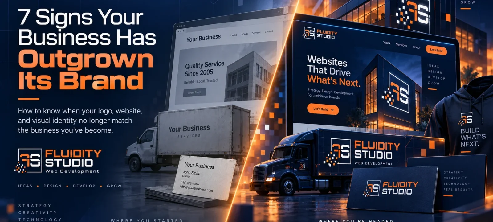
Your business may be stronger today than it has ever been.
But if your company has grown while your logo, website, and visual identity stayed the same, your business may have outgrown its brand.
You may have more experience, better clients, larger projects, a stronger reputation, and a broader range of services than you did five or ten years ago.
But does your brand still look like the company you used to be?
That disconnect happens more often than people realize.
Businesses evolve gradually. A company adds employees. Services expand. Projects get larger. Customers become more sophisticated. New competitors enter the market. The business becomes more established.
Meanwhile, the logo created years ago remains on the truck.
The same website keeps running.
The same colors, fonts, and marketing materials continue being used because they still technically work.
Eventually, the company and the identity representing it stop telling the same story.
However, that doesn’t necessarily mean the original branding was bad.
It may simply mean the business has outgrown it.
Here are seven signs that may be happening to your company.
1. Your Business Looks Smaller Than It Actually Is
This is one of the clearest signs of an outdated brand.
Imagine two companies offering similar services.
One has been operating for twenty years, has an experienced team, handles significant projects, and has built a strong local reputation.
The other is relatively new.
But when you look at their websites, vehicles, and marketing materials, the newer company appears larger and more established.
That’s a branding problem.
Customers cannot see your years of experience when they first encounter your business.
They see what you present to them.
Your logo, website, photography, vehicles, social media profiles, proposals and signage.
Those things create an impression before a customer ever speaks with you.
If the visual presentation suggests a smaller, less sophisticated company than the one you’ve actually built, your brand is underselling the business.
A stronger identity doesn’t manufacture credibility.
It makes the credibility you’ve already earned easier to recognize.
2. Your Logo Doesn’t Work Where People Actually See It
A logo should not only look good when displayed large across the top of a website.
It needs to work in the real world.
Consider all the places your identity may appear:
- a social media profile image
- the corner of a website on a phone
- embroidered on a hat
- printed on a shirt
- displayed on a truck door
- placed on a yard sign
- printed on a business card
- used as an app or browser icon
- shown on a proposal
- displayed on event signage
For example, a complicated logo may look fine at 800 pixels wide and become completely unreadable at 40 pixels.
Long company names create another challenge.
If the only recognizable version of your brand requires the full company name, you may not have a strong visual asset for smaller applications.
That’s why many effective identity systems include a secondary mark, monogram, or symbol.
Think about the difference between merely displaying a company’s name and developing something people can eventually recognize without needing to read it.
A strong brand mark can become visual shorthand.
Customers see the symbol and immediately know the company behind it.
Over time, that recognition is built through repetition.
3. Your Website and Your Business Feel Like They Come From Different Eras
Websites age faster than businesses.
A ten-year-old company may be stronger than ever while its ten-year-old website tells a very different story.
Technology changes.
Design expectations change.
Mobile usage changes.
Search behavior changes.
Customer expectations change.
And sometimes the company itself has changed substantially since the site was created.
Perhaps the original website was designed when you offered three services.
Now you offer ten.
Maybe the company originally competed primarily on affordability but now works on higher-end projects.
Or perhaps the original site was designed when almost everyone visited from a desktop computer.
Today, a large portion of potential customers may encounter the business from their phone first.
Ultimately, the question isn’t simply whether the old website still loads.
The question is whether it still represents the company effectively.
A website can technically function while strategically holding the business back.
If you hesitate before giving someone your website address, that’s worth paying attention to.
4. Your Brand Changes Depending on Where Someone Encounters You
Open your website.
Now open your Facebook page.
Then Instagram.
Look at your vehicles, business cards, proposals, email signature and signage.
Does it all feel like the same company?
Or does each piece look like it was created independently at a different point in time?
However, brand consistency is not about making everything identical.
It’s about creating enough visual consistency that every interaction reinforces the same identity.
That includes:
- logo usage
- colors
- typography
- photography
- graphic elements
- messaging
- tone
- layout
- supporting brand marks
When those elements are used consistently, recognition compounds.
Someone may see one of your trucks on Monday.
A social media post on Thursday.
A project sign the following week.
Then your website several months later when they’re finally ready to buy.
If all four experiences look connected, each encounter reinforces the others.
If they look unrelated, much of that recognition is lost.
5. Competitors Look More Established Even When They Aren’t
The best company does not automatically look like the best company.
That distinction matters.
A competitor can have less experience, fewer capabilities, and a weaker track record while creating a stronger first impression.
Customers usually don’t begin by studying every company’s history.
They scan, compare and eliminate options.
And presentation influences that process.
Professional branding can communicate:
- stability
- attention to detail
- organization
- confidence
- quality
- consistency
None of those things prove a company is better.
But they affect whether someone gives the company serious consideration.
More importantly, this becomes especially relevant in higher-value industries.
If you’re asking someone to trust your company with a major construction project, professional service engagement, commercial contract, or substantial purchase, your presentation should support the level of investment you’re asking them to make.
A $50,000 project being presented through a company that visually looks like a side business creates unnecessary friction.
Your brand should help reinforce the quality of the work rather than forcing the work to overcome the brand.
6. You’re Embarrassed to Send Someone to Your Website or Hand Them Your Materials
This may be the simplest test in the entire article.
How do you feel when someone asks:
“Do you have a website?”
Are you proud to send them there?
Or do you immediately start explaining?
“It’s pretty old.”
“We’re actually planning on redoing it.”
“Ignore that picture.”
“Those services aren’t really accurate anymore.”
Likewise, the same applies to brochures, proposals, business cards, and other marketing materials.
When you begin apologizing for your own presentation, you’ve probably already identified the problem.
Your sales materials should give you confidence.
You should want prospects to see them.
You should be comfortable sending someone to your website before speaking with them because you know the site will reinforce the impression you want to create.
If your brand creates hesitation internally, there’s a good chance customers are noticing the same weaknesses externally.
7. The Company You’re Building Today Is Different From the Company the Brand Was Designed For
In some cases, nothing is technically wrong with the old identity.
It simply represents an earlier version of the business.
Maybe you started as a small residential contractor and now handle significant commercial work.
Perhaps the company began with one service and has since expanded into several specialties.
Or what started in one city now operates throughout an entire region.
You may have moved upstream toward larger customers, added a new generation of leadership, or simply matured as a company.
Businesses evolve.
Brands occasionally need to evolve with them.
Ask yourself:
If we were creating this company today, knowing everything we know now, would we build the brand the same way?
If the answer is no, that’s worth exploring.
Rebranding Doesn’t Mean Throwing Away Everything You’ve Built
One of the biggest misconceptions about rebranding is that everything has to disappear.
It doesn’t.
A thoughtful rebrand looks at what already has value.
The company name may have recognition.
Certain colors may have become associated with the business.
A symbol may still have equity.
Customers may recognize particular elements.
The goal isn’t change for the sake of change.
The goal is alignment.
A good identity should reflect where the business is today while giving it room to grow tomorrow.
Sometimes that means an entirely new visual direction.
Other times it means simplifying, refining, and systematizing what already exists.
The correct solution depends on the business.
A Logo Is Only One Piece of the Brand
Importantly, another common mistake is treating a rebrand as a logo project.
A logo matters.
But a strong identity system asks a larger question:
What should this company look and feel like everywhere someone encounters it?
That can include:
- primary logo
- secondary logo
- recognizable brand mark
- color system
- typography
- photography direction
- graphic elements
- social media assets
- vehicle graphics
- apparel
- signage
- printed materials
- digital advertising
- website design
The logo starts the system.
Consistency makes the system valuable.
That’s when branding stops being decoration and begins becoming a business asset.
Recognition Is Built Through Repetition
Over time, the most effective brands become familiar.
You see the truck.
Later, you notice the sign.
Then someone on the crew is wearing the shirt.
A Facebook post shows up in your feed.
Eventually, you visit the website.
By that point, you may recognize the company before consciously reading the name.
For local businesses in particular, this kind of repetition can be enormously valuable.
A branded vehicle becomes advertising every time it moves through town.
An active job site creates another opportunity for people nearby to notice the company.
Branded apparel turns employees into another consistent touchpoint.
Social media then reinforces what customers have already seen offline.
Instead of repeatedly introducing the company from scratch, you’re building familiarity over time.
That’s one of the primary reasons a simple, flexible, and recognizable identity can become so powerful.
Has Your Business Outgrown Its Brand?
Ultimately, an outdated brand doesn’t mean you’ve done something wrong.
Quite often, it means you’ve done something right.
The business grew.
The work improved.
The reputation expanded.
The company matured.
The brand simply didn’t evolve at the same speed.
And that’s a much better problem to have than trying to create substance where none exists.
If your company has already built the experience, reputation, and quality behind the name, the next step may simply be making sure people can see it.
Ready for a Brand That Reflects the Business You’ve Built?
Fluidity Studio develops brand identity systems for established businesses ready for their next stage.
We look beyond the logo to understand how the identity needs to work across your website, vehicles, signage, apparel, marketing materials, social media, and every other place customers encounter your company.
And because brand and digital experience should work together, we can carry that identity through website design, custom development, and the systems behind the business as well.
If the company you’ve built today has outgrown the way it currently presents itself, it may be time to build a brand that finally catches up.