Same Roots. A Stronger Tomorrow.
Arrow Fence Company has been part of Tulsa since 1979, with decades of recognition, experienced in-house crews and a reputation built around craftsmanship, reliability and fair pricing. The opportunity is not to erase that history. It is to give the company a visual identity and digital presence that make its experience immediately visible — from the first website visit to the truck, crew, job site and finished fence.
The Business Has Outgrown the Presentation.
Arrow already has the fundamentals many local service businesses spend years trying to build: nearly five decades in Tulsa, residential and commercial capabilities, experienced employees, recognizable local history and a strong customer reputation. The current presentation communicates the basics, but it does not yet make that accumulated trust feel as distinctive or valuable as it could.
Established Since 1979
Arrow Fence was founded in Tulsa in 1979 and continues to operate as a family-owned company. That longevity is a genuine competitive asset and should be much more prominent throughout the brand.
In-House Experience
Arrow emphasizes experienced in-house installation crews rather than rotating subcontractors, with some team members having more than 15 years of fence-building experience. That operational consistency supports a stronger trust story.
Broad Residential & Commercial Capability
The company serves homeowners, businesses, HOAs, property managers and industrial applications across a wide range of wood, ornamental, chain-link, privacy, specialty and gate projects.
A Visual Identity Gap
The Arrow name is strong and memorable, but the current identity does not create an equally strong visual signature. There is an opportunity to turn the name itself into a recognizable symbol that can work across every customer touchpoint.
Make 47 Years of Trust Instantly Recognizable.
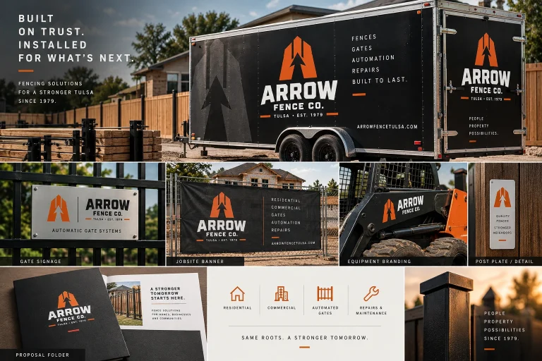
For a fence company, the brand is unusually visible in the real world. Trucks move through neighborhoods, crews spend days on-site, project signs sit beside finished work, gates remain visible for years and customers frequently discover contractors by seeing work nearby. A distinctive identity allows every one of those moments to reinforce the Arrow name instead of functioning as isolated impressions.
An A. An Arrow. A Fence. One Mark.
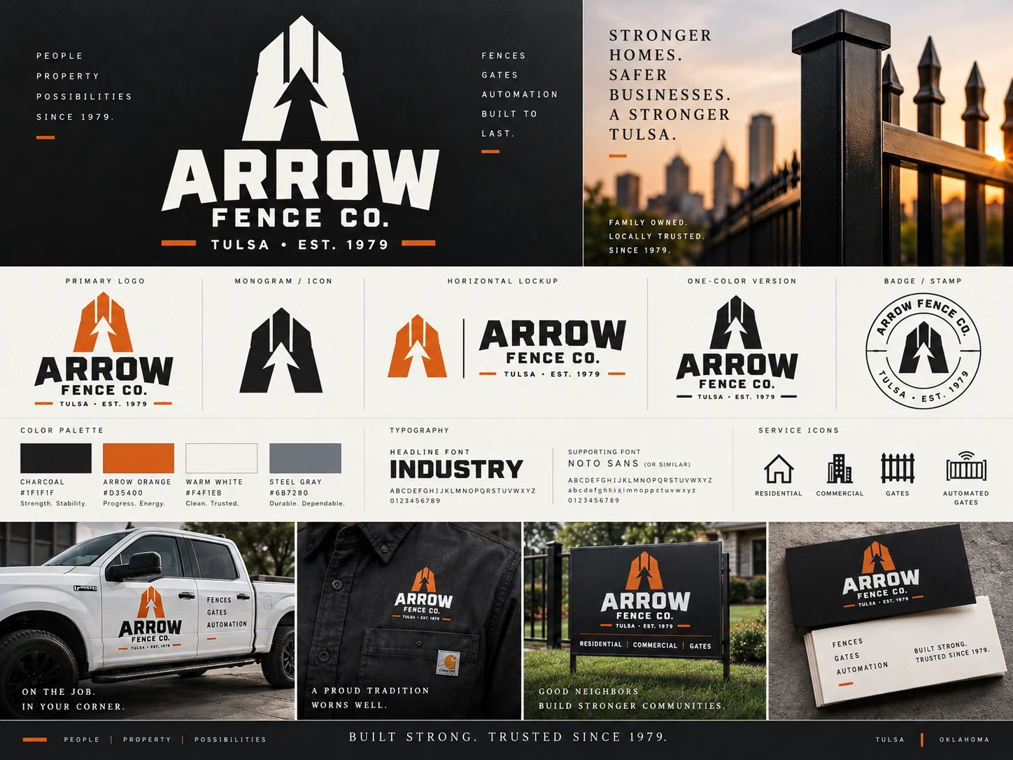
The proposed mark turns the company name into a compact visual signature. At first glance it reads as a bold capital A. The negative space creates a clear upward arrow, while the vertical structure suggests fence pickets or gate posts. The result is simple enough to recognize at a distance, but layered enough to reward a second look. It feels specific to Arrow Fence rather than like a generic contractor icon, while still respecting the company’s long-established name and heritage.
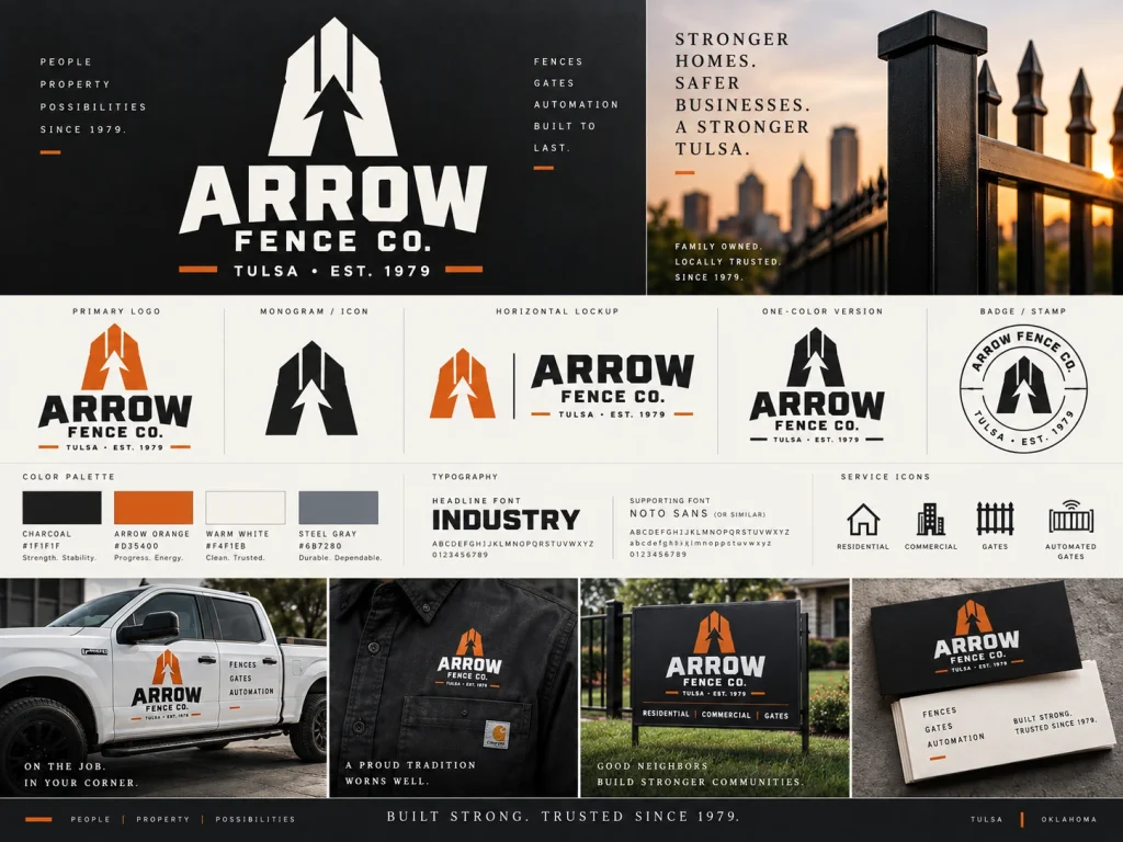
Built to Work Everywhere Arrow Works.
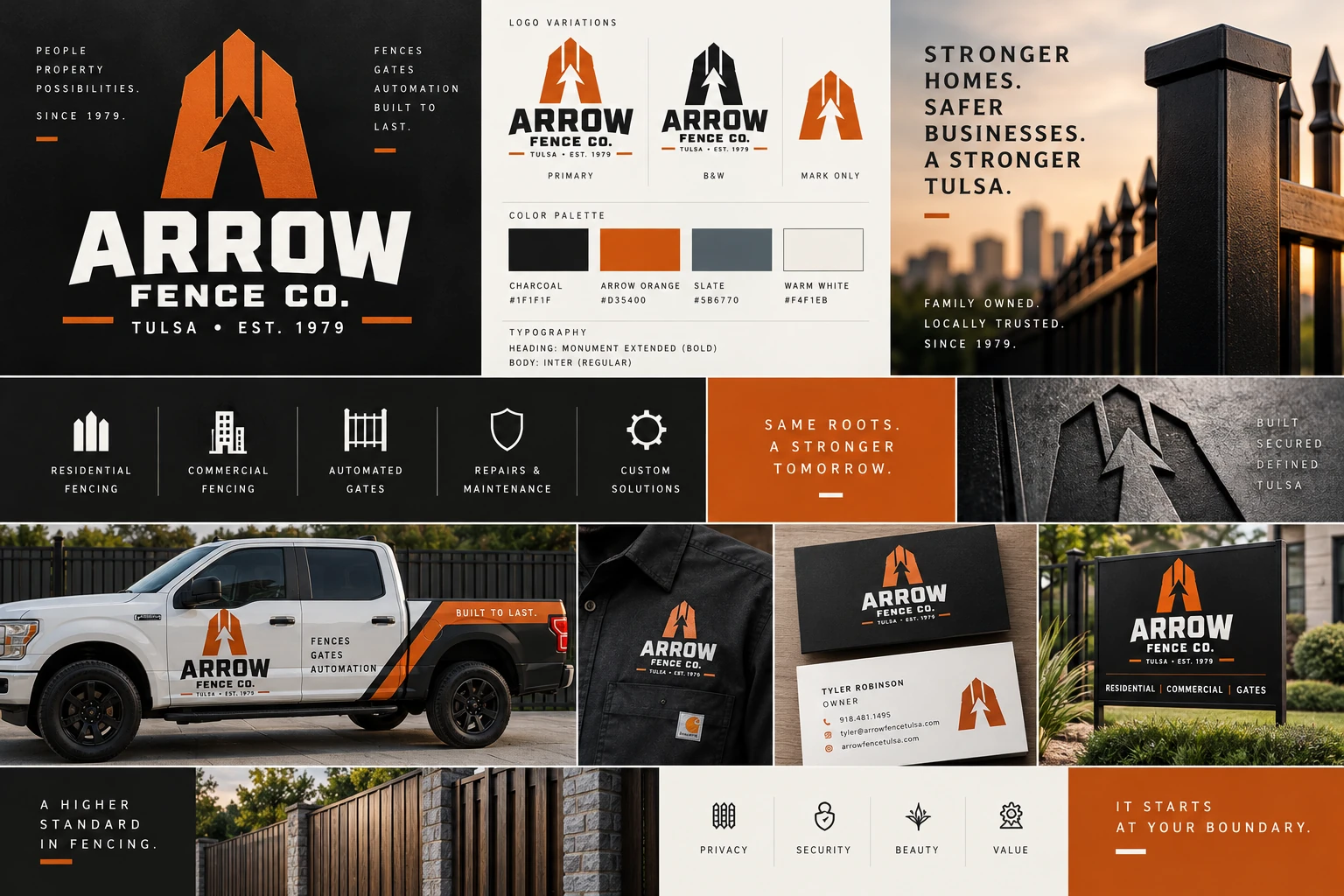
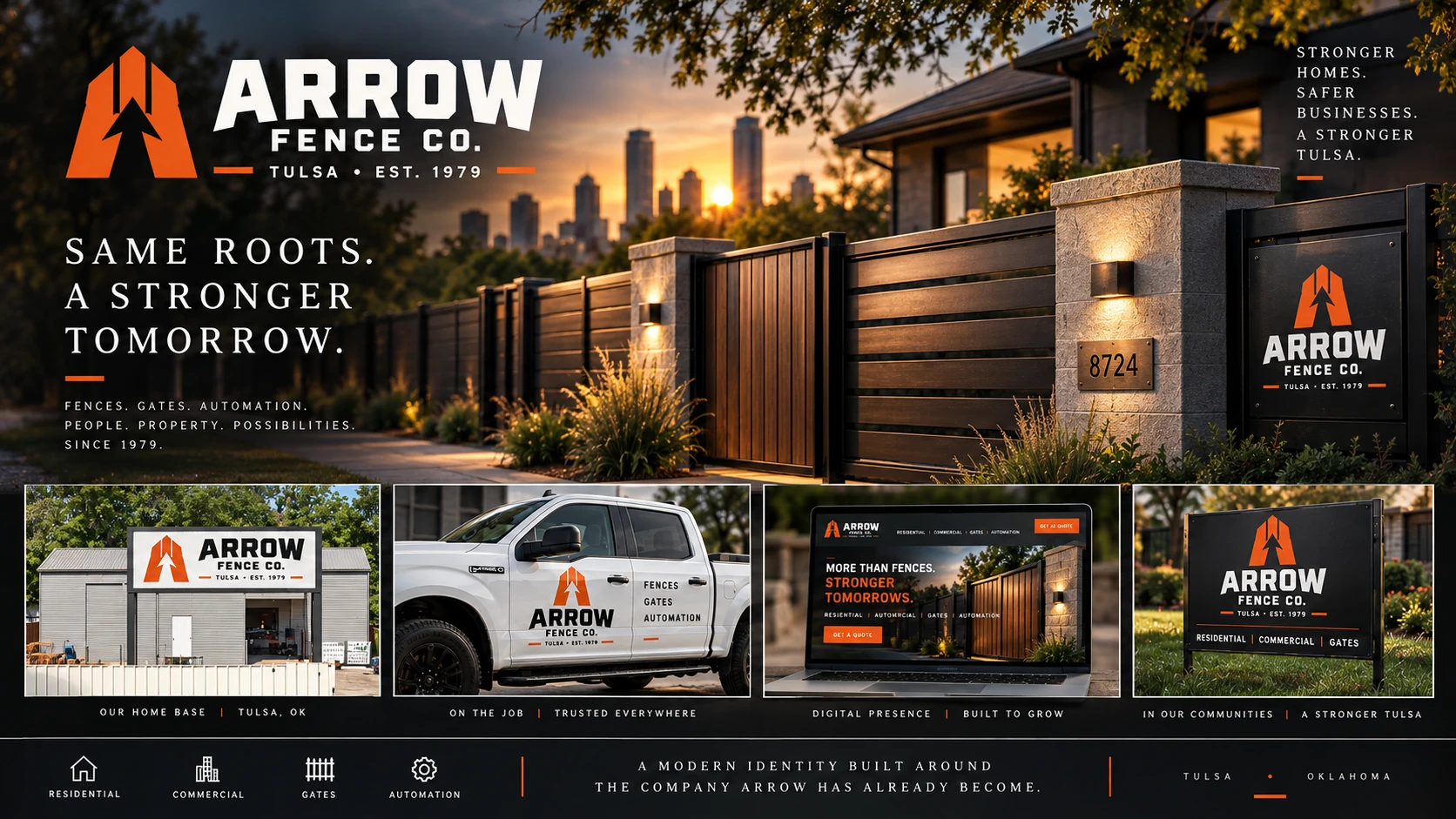
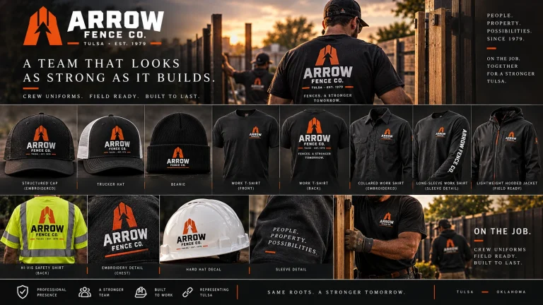
The identity is designed as a working system rather than a single logo. The primary lockup, standalone mark, one-color version, badge, typography and industrial palette can move from a website header to a hat, trailer, gate plate or job-site banner without losing recognition. Charcoal and warm white keep the system grounded and durable, while Arrow Orange creates a high-visibility signature that feels energetic without becoming loud or disposable.
Core Identity
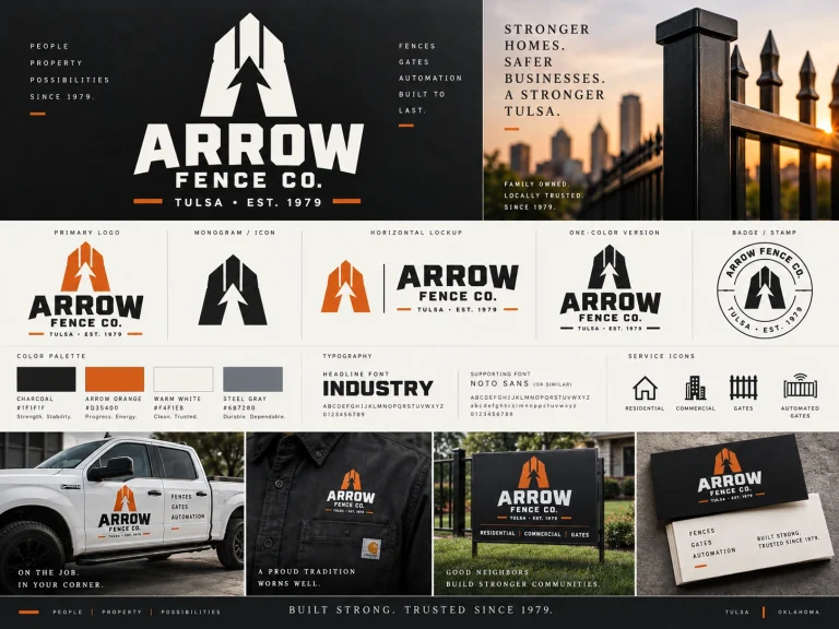
Expanded Brand System
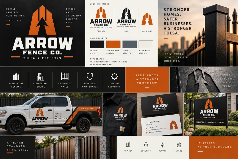
Final Brand Overview
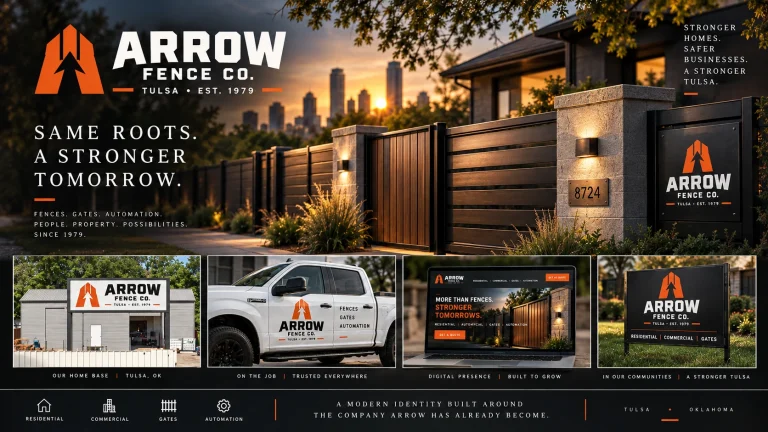
Color Palette
Every Crew, Job Site and Customer Touchpoint Becomes Part of the Brand.
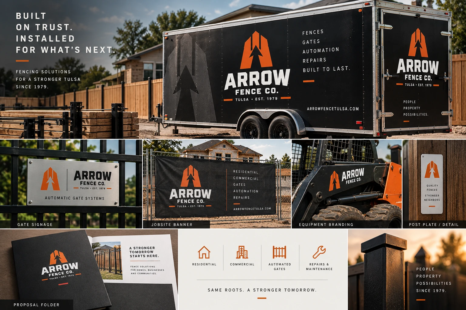
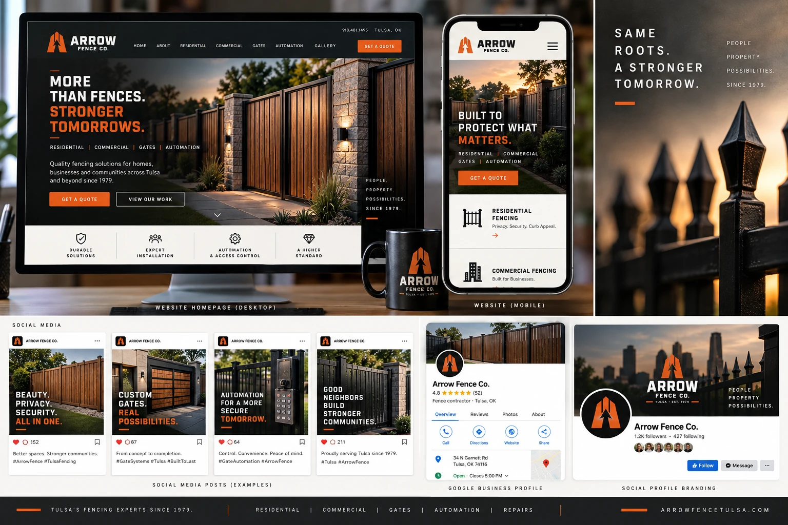
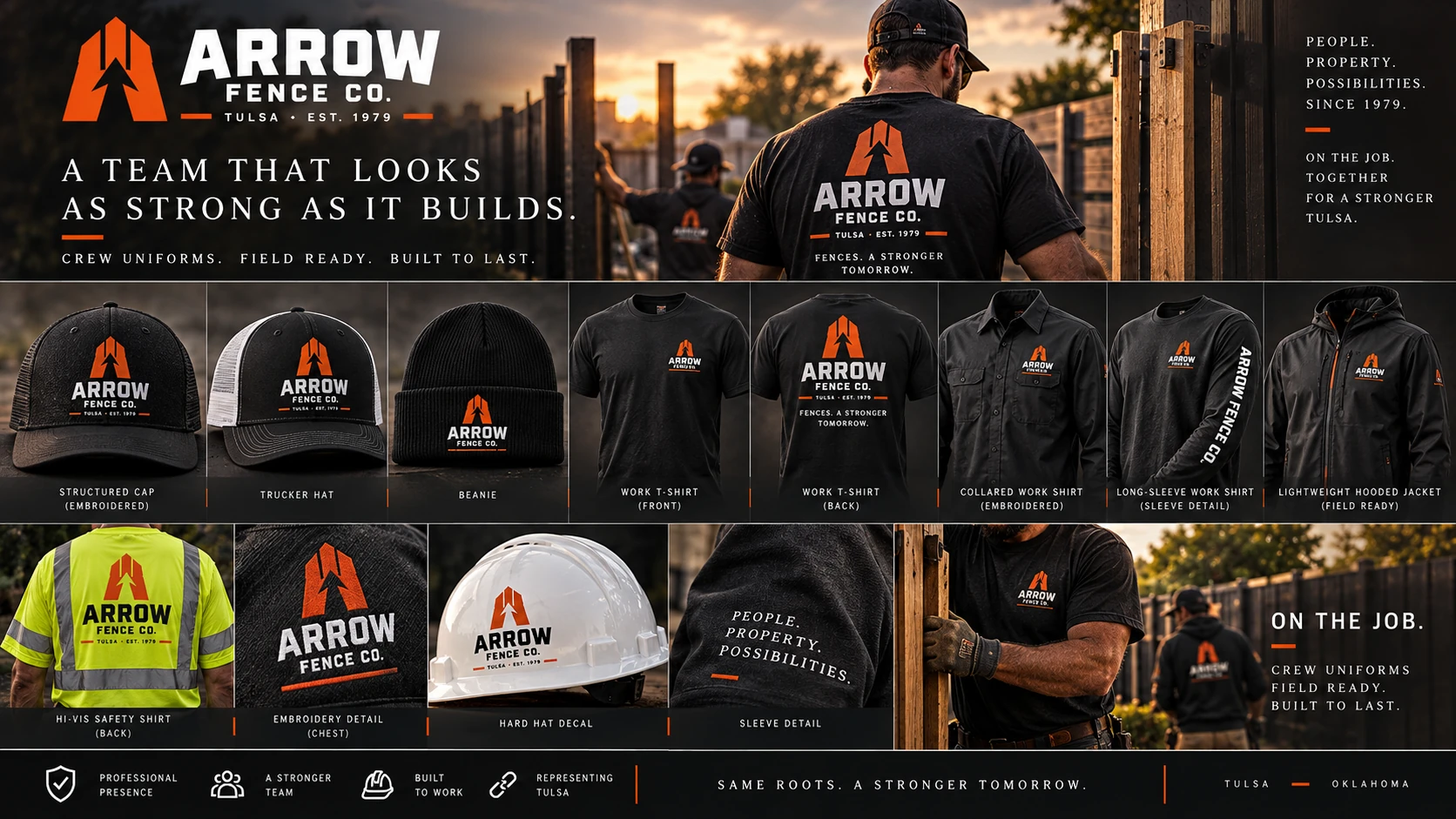
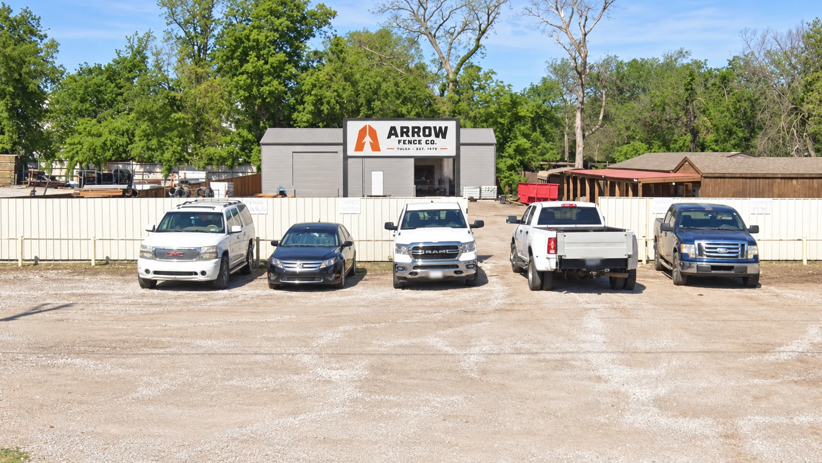
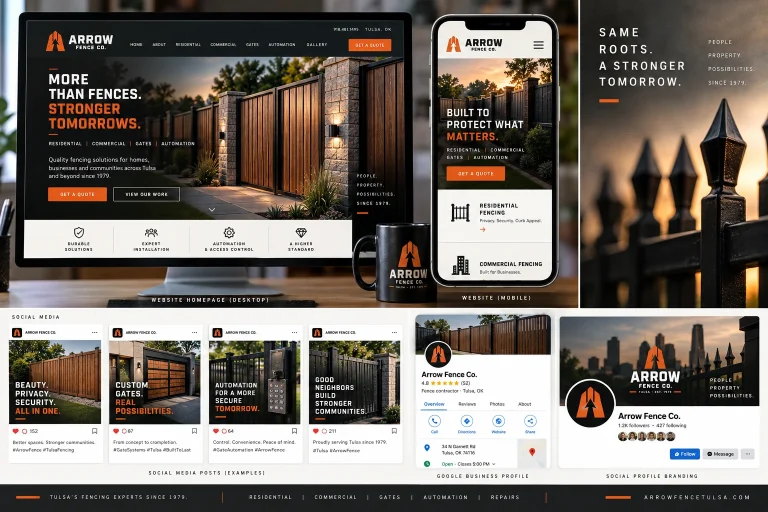
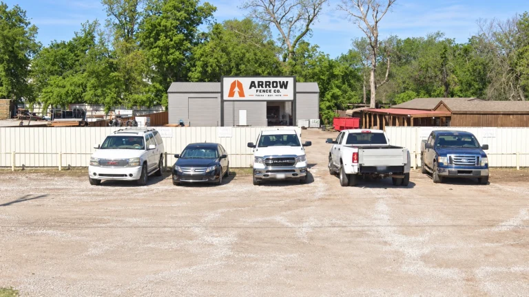
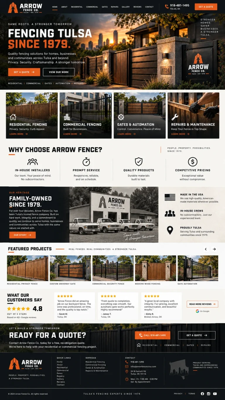
Arrow’s strongest brand opportunities are not limited to a website or business card. The company operates in highly visible environments where consistent branding can compound every day. The proposed system was tested across field equipment, trailers, crew apparel, signage, social media, the company’s physical location and a complete website concept to show how one identity can connect the entire business.
A Stronger Brand Makes the Existing Reputation Easier to See.
Distinctive
The A/arrow/fence mark creates a visual asset that is directly connected to the Arrow name and difficult for another fence company to imitate without looking derivative.
Heritage-Aware
The system does not pretend Arrow is a new company. Tulsa and Est. 1979 are deliberately integrated so the modernization reinforces the history rather than replacing it.
Field-Ready
The identity remains legible on shirts, hats, trailers, equipment, safety apparel, gate plates and signs — the places customers and neighbors are most likely to encounter the company.
Commercially Credible
The stronger system can comfortably represent Arrow in front of homeowners, property managers, HOAs, builders and larger commercial or industrial clients without changing personalities between markets.
Digitally Strong
The high-contrast visual language creates a more memorable website and social presence while supporting clear service pathways, project photography, reviews and quote requests.
Scalable
The system provides enough flexibility for future services, additional vehicles, employee apparel, campaigns and new sales materials without needing another redesign.
Modernize the Brand Without Disrupting the Business.
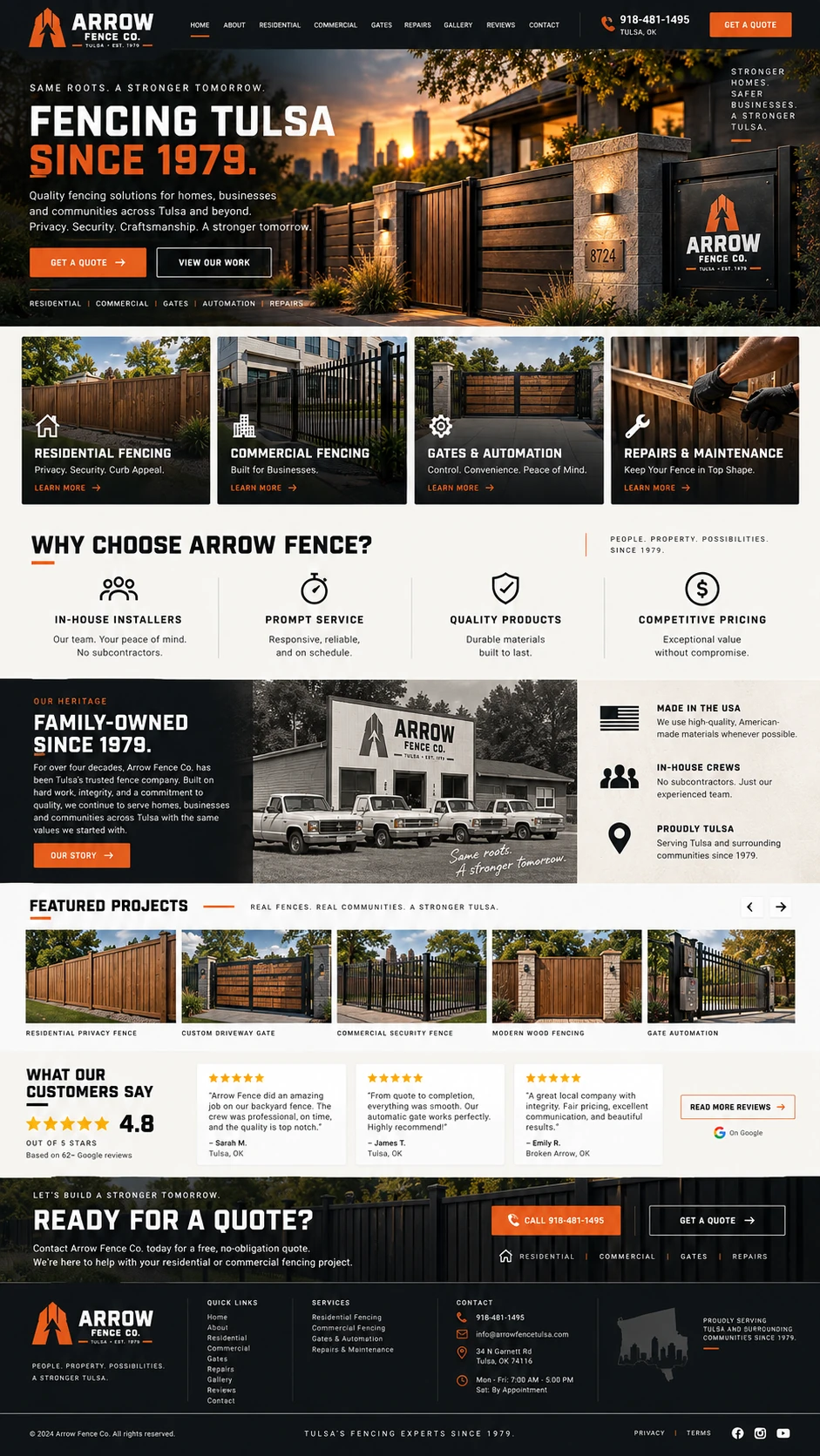
Because Arrow already has an operating WordPress site, established content and years of market recognition, the smartest rollout is evolutionary rather than disruptive. The identity can be finalized first, then introduced across the most visible physical touchpoints while the existing site content is reorganized and rebuilt into the stronger digital experience shown in the concept.
Finalize the Identity
Refine and deliver the primary logo, standalone mark, lockups, one-color files, colors, typography and practical usage standards.
Deploy High-Visibility Brand Assets
Prepare production-ready direction for crew apparel, vehicle and trailer graphics, job-site signage, equipment decals, location signage and core sales materials.
Rebuild the WordPress Experience
Use Arrow’s existing WordPress content as a practical foundation, then redesign the homepage and key service pathways around residential fencing, commercial fencing, gates and automation, and repairs or maintenance while preserving useful content and URLs wherever appropriate.
Launch as One Cohesive System
Bring the new identity live across the website, social profiles, printed materials and field applications in a coordinated rollout so customers repeatedly encounter the same Arrow brand.
Give Arrow the Brand System Its Reputation Has Earned.
For Arrow, the strongest opportunity is to treat the visual identity and website as one connected modernization rather than separate projects. Fluidity Studio can finalize the proposed identity, prepare the practical brand assets the company needs in the field, and rebuild the existing WordPress presence around the same system. Because the current site already provides useful content and an operating foundation, the engagement can focus resources on transformation rather than unnecessary reinvention.
- Brand strategy and positioning refinement
- Primary Arrow Fence logo system
- Standalone A / arrow / fence signature mark
- Logo variations and one-color production files
- Color palette and typography system
- Brand usage guidelines
- Crew apparel and workwear direction
- Vehicle, trailer and equipment branding direction
- Job-site, gate and location signage direction
- Social and digital brand assets
- WordPress homepage and site visual redesign
- Service-pathway restructuring for clearer customer entry points
- Integration and reuse of appropriate existing website content
- Responsive desktop and mobile implementation
- Launch support for the unified brand and website
Keep the Reputation. Strengthen Everything Around It.
Arrow Fence has already spent decades earning trust in Tulsa. This concept shows what happens when that history is carried by an identity, field presence and website that are just as recognizable as the name itself. The goal is not to change what Arrow is — it is to make what Arrow has already become impossible to overlook.